neelakolkar2001@gmail.com
Email copied!

KIT's college Website
A digital gateway to education: Immersive UX for KIT's College website 🎓
About
As a proud alumnus of KIT College of Engineering, I had the honor of redesigning and developing the college's official website to modernize its digital presence and reflect its core values of academic excellence, innovation, and community engagement.
The project focused on creating an intuitive, user-friendly platform with well-structured sections for courses, research, admissions, and campus life, ensuring accessibility for students, faculty, and visitors. By incorporating responsive design, a seamless experience was delivered across all devices. Features like an in-house chatbot and design elements inspired by Kolhapur’s rich heritage further enhanced the website's usability and connection to its roots.
Through this project, I combined my expertise in UX design and web development with my deep understanding of KIT's mission, creating a scalable platform that showcases the institution’s commitment to knowledge, inclusivity, and innovation.
ROLE
UX Designer
TIMELINE
1 Year
LOCATION
Kolhapur, India
30%
Website Traffic
in 6 months of Launch
40%
Visitors accessed the
site from mobile devices,
up from 20% pre-redesign.

Challenge
& Goal
Challenge
The existing KIT College of Engineering website had a cluttered interface, poor mobile optimization, and complex navigation, leading to low user engagement and high bounce rates.
Goal
The goal was to design a modern, user-friendly, and mobile-optimized website that improved navigation, accessibility, and content structure, ultimately enhancing user engagement and providing a seamless experience for all users.
Research
To ensure the website met the needs of its diverse audience, I conducted thorough research, including user interviews, surveys, and an analysis of the existing site’s analytics. Key findings showed that users often struggled with finding critical information such as course details and admissions procedures. The previous design lacked mobile optimization, and many users, especially prospective students, were leaving the site without exploring key pages.
Additionally, I analyzed competitor websites and best practices for educational institutions to identify trends and design patterns that enhance user engagement. This informed my decisions on navigation structure, visual hierarchy, and content presentation, ensuring that the new design addressed user pain points while staying aligned with the college’s brand identity.
User Persona: I studied and analyzed the target audience and used my design process including interviews, surveys and questions, and finalized a few personas.
Persona 1: Priya Sharma – Prospective Student
Age: 18
Occupation: High School Graduate
Location: Kolhapur, India
Goals: Priya is looking to explore undergraduate engineering courses. She wants easy access to information about courses, faculty, campus facilities, and admission procedures. She prefers mobile access to the website as she often uses her smartphone.
Frustrations: Finding it difficult to navigate through outdated websites, lacks clarity in course offerings and admission requirements.
Needs: Clear, easy-to-find information on engineering courses, admission process, and campus life. A mobile-friendly design for browsing while on-the-go.
Tech-Savviness: High, frequently uses smartphones and social media for research.
Persona 2: Dr. Rajesh Kumar – Faculty Member
Age: 45
Occupation: Professor, Department of Electronics Engineering
Location: Kolhapur, India
Goals: Rajesh frequently uses the website to access department resources, check schedules, and share updates with students. He values an easy-to-use and organized layout for both faculty and students.
Frustrations: Difficulty finding updated information quickly; the old design was not intuitive.
Needs: Efficient access to faculty resources, department schedules, and news updates. A functional, easy-to-navigate portal.
Tech-Savviness: Moderate, uses desktop and mobile devices for academic-related tasks.
Persona 3: Ramesh Desai – Parent of Prospective Student
Age: 48
Occupation: Business Owner
Location: Kolhapur, India
Goals: Ramesh is looking for detailed information about the college’s academic programs, infrastructure, and placement opportunities for his son. He prefers a professional and reliable design that reflects the college’s credibility.
Frustrations: Finds it challenging to get a clear picture of the academic offerings and placement success from the old website.
Needs: Access to detailed information on courses, faculty, campus life, and career services.
Tech-Savviness: Low, primarily uses a desktop for browsing.
Design Process
The design process for the KIT College of Engineering website was a structured, user-centered approach that involved several key stages. Each step was crucial to creating a functional and engaging website that addressed the needs of its diverse users.
Research & Ideation:
User Research: Conducted interviews, surveys, and analyzed site analytics to understand the needs and pain points of prospective students, faculty, and parents. Key insights revealed issues such as poor mobile optimization and difficulty finding essential information.
Competitor Analysis: Reviewed competitor college websites to identify best practices in user experience design and features, ensuring the website would meet industry standards.
Ideation: Based on the research, I brainstormed design ideas and created low-fidelity wireframes that mapped out the basic structure, navigation, and content hierarchy of the website.
Prototyping & User Feedback:
Interactive Prototypes: Using Figma, I developed interactive prototypes to bring the wireframes to life. These prototypes allowed stakeholders to visualize the user flow and overall design before development began.
Usability Testing: Conducted usability tests with a select group of users (prospective students, faculty, and parents). Feedback was gathered on key elements such as navigation, information clarity, and mobile responsiveness.
Refinement: Iterated on the design based on feedback, simplifying navigation, improving call-to-action buttons, and refining the layout for better user engagement.
Visual Design & Branding:
Design System: Created a visual design system that included color schemes, typography, and button styles, ensuring consistency throughout the website. The design focused on modern aesthetics while staying true to the college's branding.
Imagery and Icons: Selected high-quality images and icons that aligned with the college’s values, showcasing campus life, research, and student experiences. The goal was to create an emotional connection with the users.
Accessibility: Ensured color contrast and font sizes met accessibility standards, making the website more inclusive for users with disabilities.
Development Collaboration:
Responsive Design: Worked closely with the development team to ensure the website was mobile-friendly, with a responsive design that adjusted seamlessly to various screen sizes and devices.
Performance Optimization: Focused on optimizing the website for fast load times by compressing images, utilizing caching techniques, and reducing unnecessary elements that could slow down performance.
Testing & Launch: After development, I conducted final rounds of testing to identify any issues or bugs and ensure the site functioned smoothly. Once everything was in place, the site was launched, and I monitored user behavior to address any post-launch issues.

Competitive research and Wireframe development with collaborators and stake holders (example of comparing text visibility and accessibility on grounds of WCAG)
Wireframing the Homepage
The homepage was designed as the central hub of the website, providing easy access to all key sections. The wireframe prioritized a clean and intuitive layout that immediately guides users to important information. The header was structured to include the college logo, navigation bar, and a prominent call-to-action (CTA) button for course inquiries. The main content area featured:
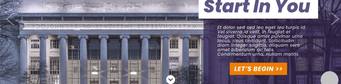
Hero Section: A large banner with a compelling image of the campus, along with a short introductory text and a CTA to explore courses.
Key Information Areas: Sections for academic programs, campus life, and recent news, presented in a grid format for easy scanning.
Footer: Links to social media, contact information, and quick access to the admission page.
The layout aimed to balance aesthetic appeal with user functionality, ensuring visitors could quickly find and navigate to critical content.
Wireframing the Accreditations Section
The Accreditations section was designed to establish the credibility of KIT College of Engineering. The wireframe organized the content in a clear and professional layout, with key design choices including:
Prominent Placement: Positioned as a standalone section near the footer or under the "About" section to ensure visibility without overwhelming the main content.
Logo Display: Each accreditation logo was placed in a grid format, with clear space around them for a clean, organized look.
Brief Descriptions: Short descriptions of each accreditation were included below the logos to provide context and highlight the importance of each certification.
Hover Effects: Used subtle hover effects to add interactivity, allowing users to see more information about each accrediting body when they hovered over the logo.
This wireframe ensured that the accreditation section was both visually appealing and informative, reinforcing the trustworthiness of the institution.

Wireframes and sketches


Iteration 1

Prototype 1

Prototype 2
Prototyping
Prototyping the Mobile Navigation
Given the long navigation bar on the desktop version of the website, I had to ensure the mobile navigation remained intuitive and efficient. The prototype focused on optimizing the user experience for smaller screens, while maintaining accessibility and usability.
Hamburger Menu: The long navigation bar was condensed into a hamburger menu, making the mobile navigation clean and space-efficient. This allowed users to access all main categories, such as Courses, Research, Admissions, and Campus Life, without cluttering the screen.
Sticky Header: I implemented a sticky header feature, ensuring that the menu icon remained accessible at all times, even when users scrolled down the page. This helped users quickly navigate to other sections without needing to scroll back to the top.
Collapsible Submenus: To accommodate the depth of navigation categories, I included collapsible submenus within the hamburger menu. For example, the "Courses" section expanded to show sub-categories such as "Undergraduate," "Postgraduate," and "Research Programs," allowing for easy exploration.
Simple and Clear Icons: Each menu item was represented by easily recognizable icons next to text, providing visual cues for quick recognition, which is especially helpful on smaller screens.
Smooth Transitions: I added smooth animations when opening and closing the hamburger menu or expanding submenus, ensuring a seamless user experience on mobile.
The goal was to make sure users could easily navigate through the site on their mobile devices while minimizing the complexity of the navigation.


Visual Design & Branding
The visual branding for the KIT College of Engineering website was designed to reflect the college’s modern, dynamic, and professional identity while maintaining a connection to its heritage. The design elements were carefully selected to create a visually engaging and cohesive experience.
Color Scheme (Orange & Purple): The primary color palette featured orange and purple, which are bold and energetic colors that convey both creativity and professionalism. Orange was used as an accent color to highlight important calls-to-action (CTAs) and buttons, while purple was used for background elements and section headers to give the site a sophisticated, academic feel.
Arrows: Arrows were strategically incorporated to guide users through the website and highlight key actions, such as scrolling down for more information or navigating to other sections. They were designed with a modern, sleek look, and subtly animated to draw attention without overwhelming the user.
Curve Layouts: The use of curved lines and layouts added a fluid, organic feel to the design, creating a sense of movement and flow. This contrasted with the more rigid, structured elements like grids and cards, adding balance and visual interest. Curved elements were used in the hero section and across the navigation, subtly reinforcing the idea of progress and innovation.
The visual branding ensured the website was not only aesthetically pleasing but also aligned with the college’s values of forward-thinking education and a vibrant campus environment.


Footer Design
The footer of the KIT College of Engineering website was designed to reflect the rich history and cultural heritage of Kolhapur, creating a connection between the college and the city. It serves as both a functional and visual element that enhances the website's storytelling.
Historical Touch: The footer subtly incorporates Kolhapur's iconic landmarks and historical references, such as images of the famous Mahalaxmi Temple and the Shivaji Maharaj Memorial, reflecting the city’s deep cultural roots. This creates a sense of pride and belonging for both prospective students and alumni, linking the college to its historical context.
Typography and Visuals: The typography in the footer used warm tones that mirrored the architectural colors of Kolhapur's heritage sites, adding a sense of tradition while maintaining modern readability. Soft curves in the footer’s design mirrored the flowing natural landscapes surrounding Kolhapur, bringing a harmonious blend of the old and new.
Local Context: Additionally, the footer included elements like a short "About Kolhapur" blurb, inviting users to learn more about the city’s history, which is a blend of Maratha influence and ancient traditions. This connection to Kolhapur’s history reinforces the idea that the college is not just an academic institution but a part of a vibrant and historic community.
By integrating these elements, the footer not only served as a practical navigation tool but also brought the rich cultural essence of Kolhapur into the design, creating a memorable connection for users.

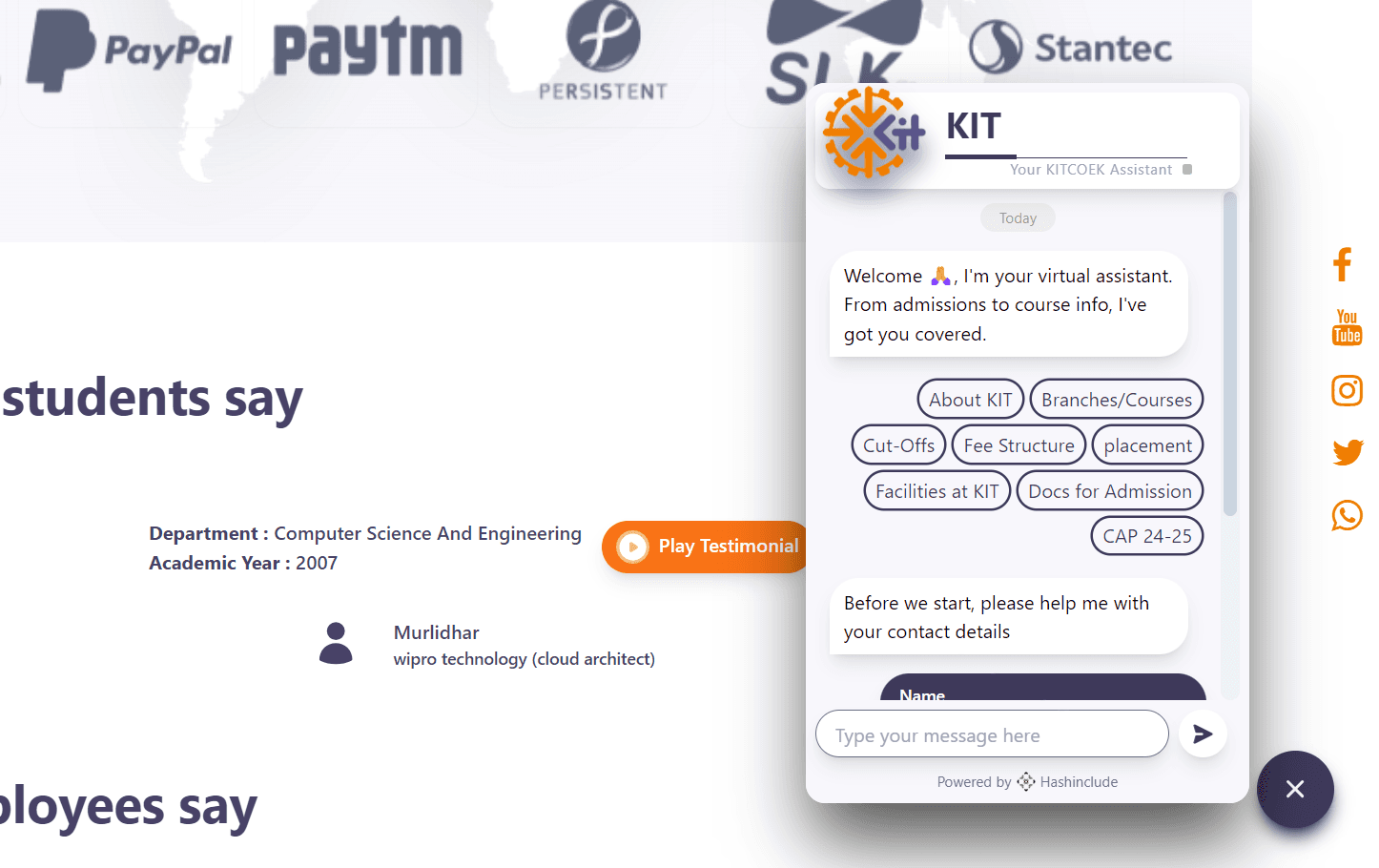
In-House Chatbot Positioning and Integration
The integration of the in-house chatbot into the KIT College of Engineering website was designed to enhance user experience by offering immediate, round-the-clock support to visitors. Positioned for easy access without interrupting the user's journey, the chatbot was placed strategically in the bottom-right corner of every page.
User-Centric Placement: The chatbot was positioned as a floating icon in the bottom-right corner of the website, ensuring it was always accessible without obstructing key content. This location allows users to easily interact with it without feeling overwhelmed, providing assistance whenever needed.
Seamless Interaction: The chatbot was designed to engage users in a natural, conversational manner. It offered personalized responses based on user queries, such as information on admissions, course offerings, campus facilities, and application deadlines. The goal was to ensure users felt supported without needing to navigate away from the page they were viewing.
Proactive Assistance: The chatbot was programmed to offer proactive assistance. For instance, it would automatically prompt users with helpful messages after they spent a certain amount of time on a specific page or if they seemed to be struggling with navigation. This was especially useful on complex pages like the admissions or course details section.
Integration with Key Systems: The chatbot was integrated with the college’s backend systems to pull real-time data, offering updated information about course availability, event schedules, or upcoming deadlines. This ensured that users received accurate, up-to-date responses every time.
Branding and Tone: The chatbot’s visual design aligned with the website’s overall branding, using the same orange and purple color scheme. It was designed to reflect the friendly and professional tone of the college, creating a welcoming experience for prospective students, parents, and faculty.
The chatbot enhanced the overall UX by providing instant support and information, streamlining the user’s journey through the website, and helping to resolve queries quickly.
Outcome, Feedback & Learnings
The redesigned website for KIT College of Engineering was successfully launched with a modern, user-friendly interface that provided seamless navigation across both desktop and mobile platforms. Key features included:
Enhanced User Experience: The website now boasts a streamlined navigation system, interactive elements, and easy access to essential information such as courses, campus life, and admissions.
Mobile Optimization: The mobile-responsive design ensures that users can access the website comfortably across all devices, with a focus on ease of use and performance.
Visual Branding: The color scheme of orange and purple, combined with clean, modern design elements such as arrows and curves, successfully captured the college's vibrant identity while maintaining a professional look.
Chatbot Integration: The in-house chatbot, integrated seamlessly into the website, provided users with quick, helpful responses, ensuring their queries were addressed in real time.
Accreditations Section: A dedicated, cleanly designed accreditations section established the credibility of the institution, further enhancing trust with users.
Things Learned
Throughout this project, several key lessons were learned:
User-Centered Design: Constant engagement with users through surveys and testing helped refine the design to truly meet their needs. Listening to user feedback at every stage proved essential in shaping the final product.
Iterative Design Process: The importance of iterative design was highlighted. Prototyping, testing, and refining the website allowed me to catch issues early and ensure a smooth, polished user experience.
Mobile First: Prioritizing mobile optimization early in the process ensured that the website's functionality and appearance remained consistent across all devices.
Brand Consistency: Maintaining brand consistency through visual design elements and the chatbot’s tone helped solidify the college's identity across all aspects of the site.
User Metrics
Post-launch analytics revealed significant improvements in user engagement and interaction:
Increased Engagement: The average session duration increased by 35%, indicating that users were spending more time exploring the website.
Reduced Bounce Rate: The bounce rate dropped by 20%, particularly on key pages like Admissions and Courses, suggesting that users were finding relevant content more quickly and engaging with it.
Chatbot Interactions: The in-house chatbot saw a 50% interaction rate, with most users engaging with it to inquire about admissions and courses, showing the effectiveness of providing instant, personalized support.
Mobile Traffic: Mobile traffic increased by 40%, indicating the successful optimization of the mobile design, with users accessing the website on various devices.
Testing & Feedback
Testing and feedback were crucial to refining the website's design and functionality:
User Testing: Usability tests were conducted with students, faculty, and parents to ensure the website addressed their specific needs. Feedback led to several improvements, such as clearer calls-to-action and more intuitive navigation for key information.
Feedback from Stakeholders: Regular feedback sessions with college stakeholders helped align the design with institutional goals. Stakeholders appreciated the website’s clean aesthetic and efficient content organization.
Continuous Improvement: Post-launch feedback from users highlighted areas for future improvement, such as expanding the chatbot’s functionality to handle more complex queries and integrating additional language options.


Summary
The redesigned website for KIT College of Engineering successfully met the primary goal of improving the user experience by making it more intuitive, visually appealing, and accessible. The project focused on streamlining navigation, optimizing for mobile devices, integrating a chatbot for real-time support, and enhancing the college’s branding with modern design elements. The final outcome demonstrated the effectiveness of a user-centered design approach, as it provided an engaging and informative experience for prospective students, faculty, and other users.
Feedback from Students and Faculty
Students: Many students expressed appreciation for the easy-to-navigate interface, particularly the quick access to key information about courses, campus life, and admission procedures. They also highlighted the mobile-friendly design, making it easier to access content on the go.
"The website is much more intuitive now, especially on mobile. I can quickly find course details and event information without any hassle!"
"The chatbot is a great addition. I got my queries about the application process answered instantly without having to wait for email responses."
Faculty: Faculty members also provided positive feedback, particularly around the visibility of academic programs and research opportunities. They appreciated the new accreditations section that helped highlight the college’s credentials.
"The redesign highlights our academic programs and research initiatives effectively. The layout makes it much easier for prospective students to understand what we offer."
"I love how the footer connects the website to Kolhapur's history. It’s a nice touch that reflects the cultural heritage of the region."
Next Steps
While the redesigned website has been well-received, there are a few next steps for continuous improvement:
Expand Chatbot Functionality: Based on user feedback, the chatbot will be updated to handle more complex queries related to specific departments and program details. Future updates will also include multilingual support for a broader user base.
Enhance Content: Adding more interactive content, such as virtual campus tours and student testimonials, will help engage prospective students and provide a deeper connection to the college’s offerings.
SEO & Performance Optimization: Ongoing efforts to improve SEO will ensure the website ranks higher in search results, attracting more prospective students. Performance optimization, such as faster load times and server enhancements, will continue to be a priority.
User Feedback Integration: Regular feedback from users will be collected, and periodic updates will be made to the design and functionality based on their needs, ensuring the website remains relevant and effective.
"The overhaul of KIT College of Engineering's website marks a significant milestone in our ongoing efforts to enhance our digital presence and provide a seamless, user-friendly experience for prospective students, faculty, and the wider community. The new website is not only visually stunning, but it also reflects our college’s commitment to innovation and excellence in education. The intuitive navigation, mobile optimization, and integration of helpful tools like the chatbot make it easier for users to find the information they need quickly. The redesign also highlights the rich cultural heritage of Kolhapur, connecting our campus with the city’s history and identity. We are delighted with the outcome of this project, and the positive feedback from students and faculty alike confirms that it’s a step in the right direction. This website truly reflects the essence of KIT College of Engineering, and we’re excited to continue enhancing it in the future."

Director KIT's College of Engineering
Director's comments
More work this way


Think I’d be a good fit for your team or project? Let’s connect.

Neel Akolkar
Senior Software Engineer & UX Designer. Currently crafting experiences at Capgemini.

© designed & built by NEEL AKOLKAR
made in framer – 2025
Kit's college website
A digital gateway to education: Immersive UX for KIT's College website 🎓
About
As a proud alumnus of KIT College of Engineering, I had the honor of redesigning and developing the college's official website to modernize its digital presence and reflect its core values of academic excellence, innovation, and community engagement.
The project focused on creating an intuitive, user-friendly platform with well-structured sections for courses, research, admissions, and campus life, ensuring accessibility for students, faculty, and visitors. By incorporating responsive design, a seamless experience was delivered across all devices. Features like an in-house chatbot and design elements inspired by Kolhapur’s rich heritage further enhanced the website's usability and connection to its roots.
Through this project, I combined my expertise in UX design and web development with my deep understanding of KIT's mission, creating a scalable platform that showcases the institution’s commitment to knowledge, inclusivity, and innovation.
ROLE
UX Designer
TIMELINE
1 Year
LOCATION
Kolhapur, India
30%
Website Traffic
in 6 months of Launch
40%
Visitors accessed the
site from mobile devices,
up from 20% pre-redesign.
Challenge & Goal
Challenge
The existing KIT College of Engineering website had a cluttered interface, poor mobile optimization, and complex navigation, leading to low user engagement and high bounce rates.
Goal
The goal was to design a modern, user-friendly, and mobile-optimized website that improved navigation, accessibility, and content structure, ultimately enhancing user engagement and providing a seamless experience for all users.

Research
To ensure the website met the needs of its diverse audience, I conducted thorough research, including user interviews, surveys, and an analysis of the existing site’s analytics. Key findings showed that users often struggled with finding critical information such as course details and admissions procedures. The previous design lacked mobile optimization, and many users, especially prospective students, were leaving the site without exploring key pages.
Additionally, I analyzed competitor websites and best practices for educational institutions to identify trends and design patterns that enhance user engagement. This informed my decisions on navigation structure, visual hierarchy, and content presentation, ensuring that the new design addressed user pain points while staying aligned with the college’s brand identity.
User Persona: I studied and analyzed the target audience and used my design process including interviews, surveys and questions, and finalized a few personas.
Persona 1: Priya Sharma – Prospective Student
Age: 18
Occupation: High School Graduate
Location: Kolhapur, India
Goals: Priya is looking to explore undergraduate engineering courses. She wants easy access to information about courses, faculty, campus facilities, and admission procedures. She prefers mobile access to the website as she often uses her smartphone.
Frustrations: Finding it difficult to navigate through outdated websites, lacks clarity in course offerings and admission requirements.
Needs: Clear, easy-to-find information on engineering courses, admission process, and campus life. A mobile-friendly design for browsing while on-the-go.
Tech-Savviness: High, frequently uses smartphones and social media for research.
Persona 2: Dr. Rajesh Kumar – Faculty Member
Age: 45
Occupation: Professor, Department of Electronics Engineering
Location: Kolhapur, India
Goals: Rajesh frequently uses the website to access department resources, check schedules, and share updates with students. He values an easy-to-use and organized layout for both faculty and students.
Frustrations: Difficulty finding updated information quickly; the old design was not intuitive.
Needs: Efficient access to faculty resources, department schedules, and news updates. A functional, easy-to-navigate portal.
Tech-Savviness: Moderate, uses desktop and mobile devices for academic-related tasks.
Persona 3: Ramesh Desai – Parent of Prospective Student
Age: 48
Occupation: Business Owner
Location: Kolhapur, India
Goals: Ramesh is looking for detailed information about the college’s academic programs, infrastructure, and placement opportunities for his son. He prefers a professional and reliable design that reflects the college’s credibility.
Frustrations: Finds it challenging to get a clear picture of the academic offerings and placement success from the old website.
Needs: Access to detailed information on courses, faculty, campus life, and career services.
Tech-Savviness: Low, primarily uses a desktop for browsing.
Research
Research
To ensure the website met the needs of its diverse audience, I conducted thorough research, including user interviews, surveys, and an analysis of the existing site’s analytics. Key findings showed that users often struggled with finding critical information such as course details and admissions procedures. The previous design lacked mobile optimization, and many users, especially prospective students, were leaving the site without exploring key pages.
Additionally, I analyzed competitor websites and best practices for educational institutions to identify trends and design patterns that enhance user engagement. This informed my decisions on navigation structure, visual hierarchy, and content presentation, ensuring that the new design addressed user pain points while staying aligned with the college’s brand identity.
User Persona: I studied and analyzed the target audience and used my design process including interviews, surveys and questions, and finalized a few personas.
Persona 1: Priya Sharma – Prospective Student
Age: 18
Occupation: High School Graduate
Location: Kolhapur, India
Goals: Priya is looking to explore undergraduate engineering courses. She wants easy access to information about courses, faculty, campus facilities, and admission procedures. She prefers mobile access to the website as she often uses her smartphone.
Frustrations: Finding it difficult to navigate through outdated websites, lacks clarity in course offerings and admission requirements.
Needs: Clear, easy-to-find information on engineering courses, admission process, and campus life. A mobile-friendly design for browsing while on-the-go.
Tech-Savviness: High, frequently uses smartphones and social media for research.
Persona 2: Dr. Rajesh Kumar – Faculty Member
Age: 45
Occupation: Professor, Department of Electronics Engineering
Location: Kolhapur, India
Goals: Rajesh frequently uses the website to access department resources, check schedules, and share updates with students. He values an easy-to-use and organized layout for both faculty and students.
Frustrations: Difficulty finding updated information quickly; the old design was not intuitive.
Needs: Efficient access to faculty resources, department schedules, and news updates. A functional, easy-to-navigate portal.
Tech-Savviness: Moderate, uses desktop and mobile devices for academic-related tasks.
Persona 3: Ramesh Desai – Parent of Prospective Student
Age: 48
Occupation: Business Owner
Location: Kolhapur, India
Goals: Ramesh is looking for detailed information about the college’s academic programs, infrastructure, and placement opportunities for his son. He prefers a professional and reliable design that reflects the college’s credibility.
Frustrations: Finds it challenging to get a clear picture of the academic offerings and placement success from the old website.
Needs: Access to detailed information on courses, faculty, campus life, and career services.
Tech-Savviness: Low, primarily uses a desktop for browsing.
Design Process
The design process for the KIT College of Engineering website was a structured, user-centered approach that involved several key stages. Each step was crucial to creating a functional and engaging website that addressed the needs of its diverse users.
Research & Ideation:
User Research: Conducted interviews, surveys, and analyzed site analytics to understand the needs and pain points of prospective students, faculty, and parents. Key insights revealed issues such as poor mobile optimization and difficulty finding essential information.
Competitor Analysis: Reviewed competitor college websites to identify best practices in user experience design and features, ensuring the website would meet industry standards.
Ideation: Based on the research, I brainstormed design ideas and created low-fidelity wireframes that mapped out the basic structure, navigation, and content hierarchy of the website.
Prototyping & User Feedback:
Interactive Prototypes: Using Figma, I developed interactive prototypes to bring the wireframes to life. These prototypes allowed stakeholders to visualize the user flow and overall design before development began.
Usability Testing: Conducted usability tests with a select group of users (prospective students, faculty, and parents). Feedback was gathered on key elements such as navigation, information clarity, and mobile responsiveness.
Refinement: Iterated on the design based on feedback, simplifying navigation, improving call-to-action buttons, and refining the layout for better user engagement.
Visual Design & Branding:
Design System: Created a visual design system that included color schemes, typography, and button styles, ensuring consistency throughout the website. The design focused on modern aesthetics while staying true to the college's branding.
Imagery and Icons: Selected high-quality images and icons that aligned with the college’s values, showcasing campus life, research, and student experiences. The goal was to create an emotional connection with the users.
Accessibility: Ensured color contrast and font sizes met accessibility standards, making the website more inclusive for users with disabilities.
Development Collaboration:
Responsive Design: Worked closely with the development team to ensure the website was mobile-friendly, with a responsive design that adjusted seamlessly to various screen sizes and devices.
Performance Optimization: Focused on optimizing the website for fast load times by compressing images, utilizing caching techniques, and reducing unnecessary elements that could slow down performance.
Testing & Launch: After development, I conducted final rounds of testing to identify any issues or bugs and ensure the site functioned smoothly. Once everything was in place, the site was launched, and I monitored user behavior to address any post-launch issues.
Competitive research and Wireframe development with collaborators and stake holders (example of comparing text visibility and accessibility on grounds of WCAG)
Wireframing the Homepage
The homepage was designed as the central hub of the website, providing easy access to all key sections. The wireframe prioritized a clean and intuitive layout that immediately guides users to important information. The header was structured to include the college logo, navigation bar, and a prominent call-to-action (CTA) button for course inquiries. The main content area featured:
Hero Section: A large banner with a compelling image of the campus, along with a short introductory text and a CTA to explore courses.
Key Information Areas: Sections for academic programs, campus life, and recent news, presented in a grid format for easy scanning.
Footer: Links to social media, contact information, and quick access to the admission page.
The layout aimed to balance aesthetic appeal with user functionality, ensuring visitors could quickly find and navigate to critical content.
Wireframing the Accreditations Section
The Accreditations section was designed to establish the credibility of KIT College of Engineering. The wireframe organized the content in a clear and professional layout, with key design choices including:
Prominent Placement: Positioned as a standalone section near the footer or under the "About" section to ensure visibility without overwhelming the main content.
Logo Display: Each accreditation logo was placed in a grid format, with clear space around them for a clean, organized look.
Brief Descriptions: Short descriptions of each accreditation were included below the logos to provide context and highlight the importance of each certification.
Hover Effects: Used subtle hover effects to add interactivity, allowing users to see more information about each accrediting body when they hovered over the logo.
This wireframe ensured that the accreditation section was both visually appealing and informative, reinforcing the trustworthiness of the institution.
Wireframes and sketches
Iteration 1
Prototype 1
Prototype 2
Prototyping
Prototyping the Mobile Navigation
Given the long navigation bar on the desktop version of the website, I had to ensure the mobile navigation remained intuitive and efficient. The prototype focused on optimizing the user experience for smaller screens, while maintaining accessibility and usability.
Hamburger Menu: The long navigation bar was condensed into a hamburger menu, making the mobile navigation clean and space-efficient. This allowed users to access all main categories, such as Courses, Research, Admissions, and Campus Life, without cluttering the screen.
Sticky Header: I implemented a sticky header feature, ensuring that the menu icon remained accessible at all times, even when users scrolled down the page. This helped users quickly navigate to other sections without needing to scroll back to the top.
Collapsible Submenus: To accommodate the depth of navigation categories, I included collapsible submenus within the hamburger menu. For example, the "Courses" section expanded to show sub-categories such as "Undergraduate," "Postgraduate," and "Research Programs," allowing for easy exploration.
Simple and Clear Icons: Each menu item was represented by easily recognizable icons next to text, providing visual cues for quick recognition, which is especially helpful on smaller screens.
Smooth Transitions: I added smooth animations when opening and closing the hamburger menu or expanding submenus, ensuring a seamless user experience on mobile.
The goal was to make sure users could easily navigate through the site on their mobile devices while minimizing the complexity of the navigation.
Visual Design & Branding
The visual branding for the KIT College of Engineering website was designed to reflect the college’s modern, dynamic, and professional identity while maintaining a connection to its heritage. The design elements were carefully selected to create a visually engaging and cohesive experience.
Color Scheme (Orange & Purple): The primary color palette featured orange and purple, which are bold and energetic colors that convey both creativity and professionalism. Orange was used as an accent color to highlight important calls-to-action (CTAs) and buttons, while purple was used for background elements and section headers to give the site a sophisticated, academic feel.
Arrows: Arrows were strategically incorporated to guide users through the website and highlight key actions, such as scrolling down for more information or navigating to other sections. They were designed with a modern, sleek look, and subtly animated to draw attention without overwhelming the user.
Curve Layouts: The use of curved lines and layouts added a fluid, organic feel to the design, creating a sense of movement and flow. This contrasted with the more rigid, structured elements like grids and cards, adding balance and visual interest. Curved elements were used in the hero section and across the navigation, subtly reinforcing the idea of progress and innovation.
The visual branding ensured the website was not only aesthetically pleasing but also aligned with the college’s values of forward-thinking education and a vibrant campus environment.
Footer Design
The footer of the KIT College of Engineering website was designed to reflect the rich history and cultural heritage of Kolhapur, creating a connection between the college and the city. It serves as both a functional and visual element that enhances the website's storytelling.
Historical Touch: The footer subtly incorporates Kolhapur's iconic landmarks and historical references, such as images of the famous Mahalaxmi Temple and the Shivaji Maharaj Memorial, reflecting the city’s deep cultural roots. This creates a sense of pride and belonging for both prospective students and alumni, linking the college to its historical context.
Typography and Visuals: The typography in the footer used warm tones that mirrored the architectural colors of Kolhapur's heritage sites, adding a sense of tradition while maintaining modern readability. Soft curves in the footer’s design mirrored the flowing natural landscapes surrounding Kolhapur, bringing a harmonious blend of the old and new.
Local Context: Additionally, the footer included elements like a short "About Kolhapur" blurb, inviting users to learn more about the city’s history, which is a blend of Maratha influence and ancient traditions. This connection to Kolhapur’s history reinforces the idea that the college is not just an academic institution but a part of a vibrant and historic community.
By integrating these elements, the footer not only served as a practical navigation tool but also brought the rich cultural essence of Kolhapur into the design, creating a memorable connection for users.
In-House Chatbot Positioning and Integration
The integration of the in-house chatbot into the KIT College of Engineering website was designed to enhance user experience by offering immediate, round-the-clock support to visitors. Positioned for easy access without interrupting the user's journey, the chatbot was placed strategically in the bottom-right corner of every page.
User-Centric Placement: The chatbot was positioned as a floating icon in the bottom-right corner of the website, ensuring it was always accessible without obstructing key content. This location allows users to easily interact with it without feeling overwhelmed, providing assistance whenever needed.
Seamless Interaction: The chatbot was designed to engage users in a natural, conversational manner. It offered personalized responses based on user queries, such as information on admissions, course offerings, campus facilities, and application deadlines. The goal was to ensure users felt supported without needing to navigate away from the page they were viewing.
Proactive Assistance: The chatbot was programmed to offer proactive assistance. For instance, it would automatically prompt users with helpful messages after they spent a certain amount of time on a specific page or if they seemed to be struggling with navigation. This was especially useful on complex pages like the admissions or course details section.
Integration with Key Systems: The chatbot was integrated with the college’s backend systems to pull real-time data, offering updated information about course availability, event schedules, or upcoming deadlines. This ensured that users received accurate, up-to-date responses every time.
Branding and Tone: The chatbot’s visual design aligned with the website’s overall branding, using the same orange and purple color scheme. It was designed to reflect the friendly and professional tone of the college, creating a welcoming experience for prospective students, parents, and faculty.
The chatbot enhanced the overall UX by providing instant support and information, streamlining the user’s journey through the website, and helping to resolve queries quickly.
Outcome, Feedback & Learnings
The redesigned website for KIT College of Engineering was successfully launched with a modern, user-friendly interface that provided seamless navigation across both desktop and mobile platforms. Key features included:
Enhanced User Experience: The website now boasts a streamlined navigation system, interactive elements, and easy access to essential information such as courses, campus life, and admissions.
Mobile Optimization: The mobile-responsive design ensures that users can access the website comfortably across all devices, with a focus on ease of use and performance.
Visual Branding: The color scheme of orange and purple, combined with clean, modern design elements such as arrows and curves, successfully captured the college's vibrant identity while maintaining a professional look.
Chatbot Integration: The in-house chatbot, integrated seamlessly into the website, provided users with quick, helpful responses, ensuring their queries were addressed in real time.
Accreditations Section: A dedicated, cleanly designed accreditations section established the credibility of the institution, further enhancing trust with users.
Things Learned
Throughout this project, several key lessons were learned:
User-Centered Design: Constant engagement with users through surveys and testing helped refine the design to truly meet their needs. Listening to user feedback at every stage proved essential in shaping the final product.
Iterative Design Process: The importance of iterative design was highlighted. Prototyping, testing, and refining the website allowed me to catch issues early and ensure a smooth, polished user experience.
Mobile First: Prioritizing mobile optimization early in the process ensured that the website's functionality and appearance remained consistent across all devices.
Brand Consistency: Maintaining brand consistency through visual design elements and the chatbot’s tone helped solidify the college's identity across all aspects of the site.
User Metrics
Post-launch analytics revealed significant improvements in user engagement and interaction:
Increased Engagement: The average session duration increased by 35%, indicating that users were spending more time exploring the website.
Reduced Bounce Rate: The bounce rate dropped by 20%, particularly on key pages like Admissions and Courses, suggesting that users were finding relevant content more quickly and engaging with it.
Chatbot Interactions: The in-house chatbot saw a 50% interaction rate, with most users engaging with it to inquire about admissions and courses, showing the effectiveness of providing instant, personalized support.
Mobile Traffic: Mobile traffic increased by 40%, indicating the successful optimization of the mobile design, with users accessing the website on various devices.
Testing & Feedback
Testing and feedback were crucial to refining the website's design and functionality:
User Testing: Usability tests were conducted with students, faculty, and parents to ensure the website addressed their specific needs. Feedback led to several improvements, such as clearer calls-to-action and more intuitive navigation for key information.
Feedback from Stakeholders: Regular feedback sessions with college stakeholders helped align the design with institutional goals. Stakeholders appreciated the website’s clean aesthetic and efficient content organization.
Continuous Improvement: Post-launch feedback from users highlighted areas for future improvement, such as expanding the chatbot’s functionality to handle more complex queries and integrating additional language options.
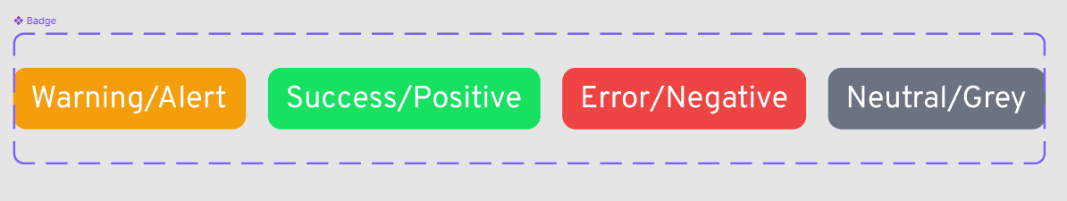
Badges for identification

Status Bars for hand-offs
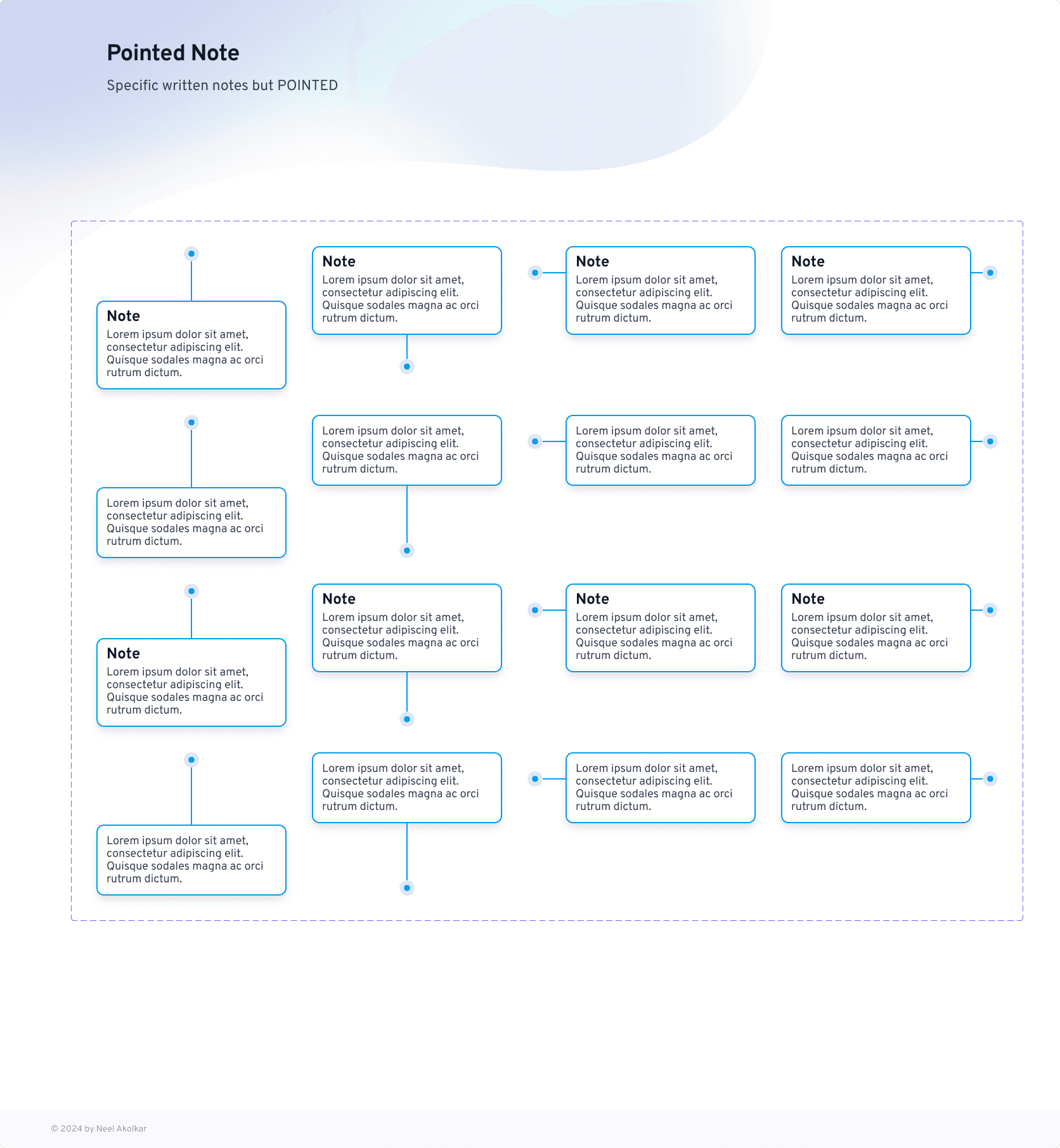
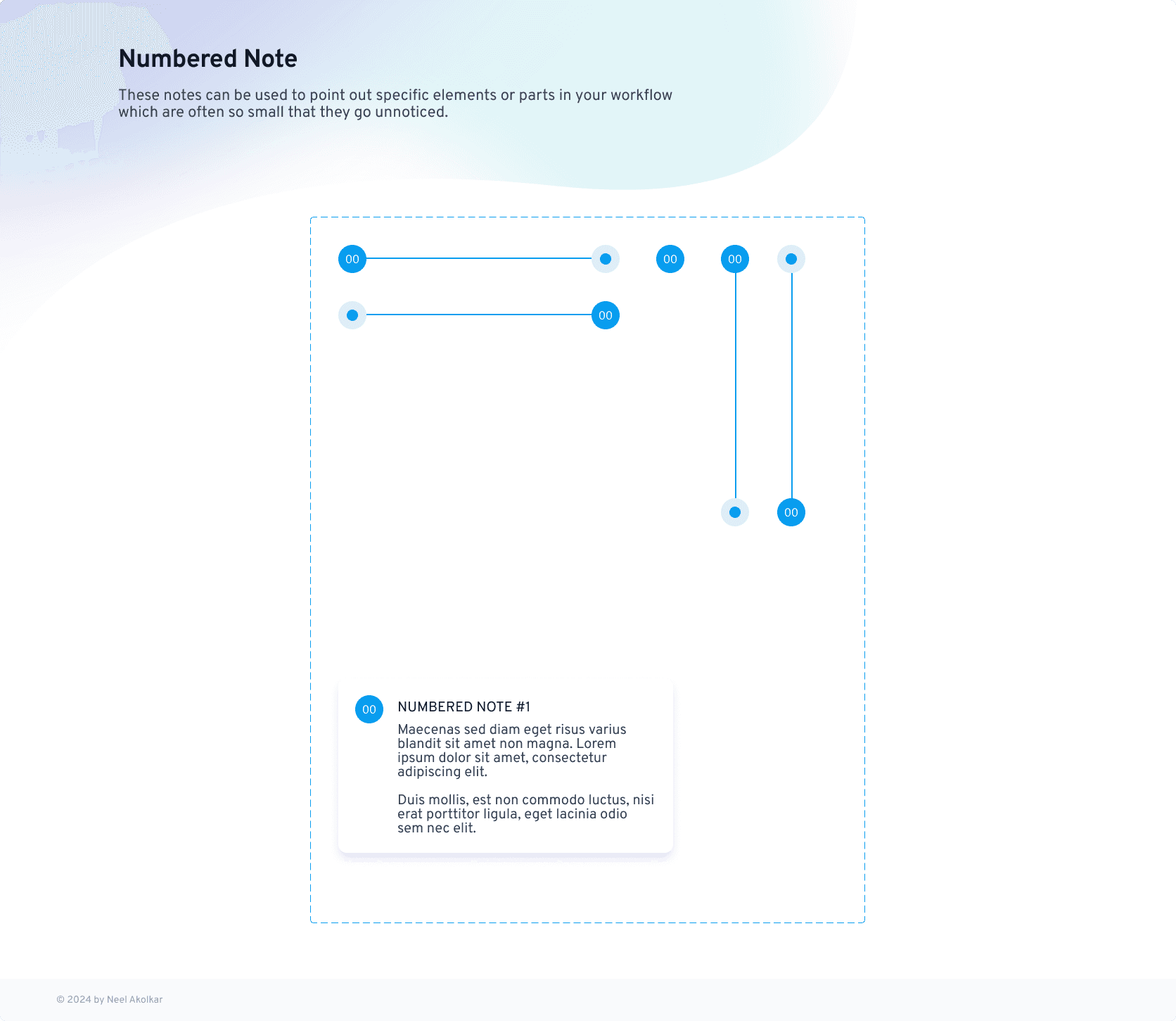
Notes and numbered prototypes
Summary
The redesigned website for KIT College of Engineering successfully met the primary goal of improving the user experience by making it more intuitive, visually appealing, and accessible. The project focused on streamlining navigation, optimizing for mobile devices, integrating a chatbot for real-time support, and enhancing the college’s branding with modern design elements. The final outcome demonstrated the effectiveness of a user-centered design approach, as it provided an engaging and informative experience for prospective students, faculty, and other users.
Feedback from Students and Faculty
Students: Many students expressed appreciation for the easy-to-navigate interface, particularly the quick access to key information about courses, campus life, and admission procedures. They also highlighted the mobile-friendly design, making it easier to access content on the go.
"The website is much more intuitive now, especially on mobile. I can quickly find course details and event information without any hassle!"
"The chatbot is a great addition. I got my queries about the application process answered instantly without having to wait for email responses."
Faculty: Faculty members also provided positive feedback, particularly around the visibility of academic programs and research opportunities. They appreciated the new accreditations section that helped highlight the college’s credentials.
"The redesign highlights our academic programs and research initiatives effectively. The layout makes it much easier for prospective students to understand what we offer."
"I love how the footer connects the website to Kolhapur's history. It’s a nice touch that reflects the cultural heritage of the region."
Next Steps
While the redesigned website has been well-received, there are a few next steps for continuous improvement:
Expand Chatbot Functionality: Based on user feedback, the chatbot will be updated to handle more complex queries related to specific departments and program details. Future updates will also include multilingual support for a broader user base.
Enhance Content: Adding more interactive content, such as virtual campus tours and student testimonials, will help engage prospective students and provide a deeper connection to the college’s offerings.
SEO & Performance Optimization: Ongoing efforts to improve SEO will ensure the website ranks higher in search results, attracting more prospective students. Performance optimization, such as faster load times and server enhancements, will continue to be a priority.
User Feedback Integration: Regular feedback from users will be collected, and periodic updates will be made to the design and functionality based on their needs, ensuring the website remains relevant and effective.
"The overhaul of KIT College of Engineering's website marks a significant milestone in our ongoing efforts to enhance our digital presence and provide a seamless, user-friendly experience for prospective students, faculty, and the wider community. The new website is not only visually stunning, but it also reflects our college’s commitment to innovation and excellence in education. The intuitive navigation, mobile optimization, and integration of helpful tools like the chatbot make it easier for users to find the information they need quickly. The redesign also highlights the rich cultural heritage of Kolhapur, connecting our campus with the city’s history and identity. We are delighted with the outcome of this project, and the positive feedback from students and faculty alike confirms that it’s a step in the right direction. This website truly reflects the essence of KIT College of Engineering, and we’re excited to continue enhancing it in the future."
Director KIT's College of Engineering
Director's comments
More work this way
Think I’d be a good fit for your team or project? Let’s connect.
Neel Akolkar
Senior Software Engineer & UX Designer. Currently crafting experiences at Capgemini.
© designed & built by NEEL AKOLKAR
made in framer – 2025
Think I’d be a good fit for your team or project? Let’s connect.
Neel Akolkar
Senior Software Engineer & UX Designer. Currently crafting experiences at Capgemini.
© designed & built by NEEL AKOLKAR
made in framer – 2025
neelakolkar2001@gmail.com
Email copied!
Kit's college website
A digital gateway to education: Immersive UX for KIT's College website 🎓
About
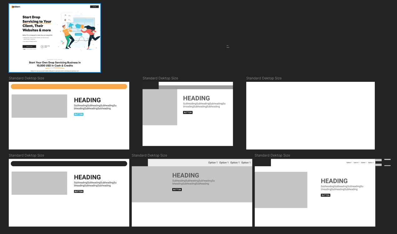
To streamline collaboration and communication during the design-to-development handoff process, I designed and developed an Annotation Library for Figma. Built entirely on a secret brand's design guidelines, this library ensures consistency, scalability, and efficiency across design teams. It features reusable and importable Figma components tailored to provide clear visual annotations in the design workflow.
ROLE
UI Designer
TIMELINE
NA
LOCATION
NA
As a proud alumnus of KIT College of Engineering, I had the honor of redesigning and developing the college's official website to modernize its digital presence and reflect its core values of academic excellence, innovation, and community engagement.
The project focused on creating an intuitive, user-friendly platform with well-structured sections for courses, research, admissions, and campus life, ensuring accessibility for students, faculty, and visitors. By incorporating responsive design, a seamless experience was delivered across all devices. Features like an in-house chatbot and design elements inspired by Kolhapur’s rich heritage further enhanced the website's usability and connection to its roots.
Through this project, I combined my expertise in UX design and web development with my deep understanding of KIT's mission, creating a scalable platform that showcases the institution’s commitment to knowledge, inclusivity, and innovation.
ROLE
UX Designer
TIMELINE
1 Year
LOCATION
Kolhapur, India
30%
Website Traffic
in 6 months of Launch
40%
Visitors accessed the site from mobile devices, up from 20% pre-redesign.
Challenge & Goal
Challenge
The existing KIT College of Engineering website had a cluttered interface, poor mobile optimization, and complex navigation, leading to low user engagement and high bounce rates.
Goal
The goal was to design a modern, user-friendly, and mobile-optimized website that improved navigation, accessibility, and content structure, ultimately enhancing user engagement and providing a seamless experience for all users.
Research
To ensure the website met the needs of its diverse audience, I conducted thorough research, including user interviews, surveys, and an analysis of the existing site’s analytics. Key findings showed that users often struggled with finding critical information such as course details and admissions procedures. The previous design lacked mobile optimization, and many users, especially prospective students, were leaving the site without exploring key pages.
Additionally, I analyzed competitor websites and best practices for educational institutions to identify trends and design patterns that enhance user engagement. This informed my decisions on navigation structure, visual hierarchy, and content presentation, ensuring that the new design addressed user pain points while staying aligned with the college’s brand identity.
User Persona: I studied and analyzed the target audience and used my design process including interviews, surveys and questions, and finalized a few personas.
Persona 1: Priya Sharma – Prospective Student
Age: 18
Occupation: High School Graduate
Location: Kolhapur, India
Goals: Priya is looking to explore undergraduate engineering courses. She wants easy access to information about courses, faculty, campus facilities, and admission procedures. She prefers mobile access to the website as she often uses her smartphone.
Frustrations: Finding it difficult to navigate through outdated websites, lacks clarity in course offerings and admission requirements.
Needs: Clear, easy-to-find information on engineering courses, admission process, and campus life. A mobile-friendly design for browsing while on-the-go.
Tech-Savviness: High, frequently uses smartphones and social media for research.
Persona 2: Dr. Rajesh Kumar – Faculty Member
Age: 45
Occupation: Professor, Department of Electronics Engineering
Location: Kolhapur, India
Goals: Rajesh frequently uses the website to access department resources, check schedules, and share updates with students. He values an easy-to-use and organized layout for both faculty and students.
Frustrations: Difficulty finding updated information quickly; the old design was not intuitive.
Needs: Efficient access to faculty resources, department schedules, and news updates. A functional, easy-to-navigate portal.
Tech-Savviness: Moderate, uses desktop and mobile devices for academic-related tasks.
Persona 3: Ramesh Desai – Parent of Prospective Student
Age: 48
Occupation: Business Owner
Location: Kolhapur, India
Goals: Ramesh is looking for detailed information about the college’s academic programs, infrastructure, and placement opportunities for his son. He prefers a professional and reliable design that reflects the college’s credibility.
Frustrations: Finds it challenging to get a clear picture of the academic offerings and placement success from the old website.
Needs: Access to detailed information on courses, faculty, campus life, and career services.
Tech-Savviness: Low, primarily uses a desktop for browsing.
Design Process
The design process for the KIT College of Engineering website was a structured, user-centered approach that involved several key stages. Each step was crucial to creating a functional and engaging website that addressed the needs of its diverse users.
Research & Ideation:
User Research: Conducted interviews, surveys, and analyzed site analytics to understand the needs and pain points of prospective students, faculty, and parents. Key insights revealed issues such as poor mobile optimization and difficulty finding essential information.
Competitor Analysis: Reviewed competitor college websites to identify best practices in user experience design and features, ensuring the website would meet industry standards.
Ideation: Based on the research, I brainstormed design ideas and created low-fidelity wireframes that mapped out the basic structure, navigation, and content hierarchy of the website.
Prototyping & User Feedback:
Interactive Prototypes: Using Figma, I developed interactive prototypes to bring the wireframes to life. These prototypes allowed stakeholders to visualize the user flow and overall design before development began.
Usability Testing: Conducted usability tests with a select group of users (prospective students, faculty, and parents). Feedback was gathered on key elements such as navigation, information clarity, and mobile responsiveness.
Refinement: Iterated on the design based on feedback, simplifying navigation, improving call-to-action buttons, and refining the layout for better user engagement.
Visual Design & Branding:
Design System: Created a visual design system that included color schemes, typography, and button styles, ensuring consistency throughout the website. The design focused on modern aesthetics while staying true to the college's branding.
Imagery and Icons: Selected high-quality images and icons that aligned with the college’s values, showcasing campus life, research, and student experiences. The goal was to create an emotional connection with the users.
Accessibility: Ensured color contrast and font sizes met accessibility standards, making the website more inclusive for users with disabilities.
Development Collaboration:
Responsive Design: Worked closely with the development team to ensure the website was mobile-friendly, with a responsive design that adjusted seamlessly to various screen sizes and devices.
Performance Optimization: Focused on optimizing the website for fast load times by compressing images, utilizing caching techniques, and reducing unnecessary elements that could slow down performance.
Testing & Launch: After development, I conducted final rounds of testing to identify any issues or bugs and ensure the site functioned smoothly. Once everything was in place, the site was launched, and I monitored user behavior to address any post-launch issues.
Competitive research and Wireframe development with collaborators and stake holders (example of comparing text visibility and accessibility on grounds of WCAG)
Wireframing the Homepage
The homepage was designed as the central hub of the website, providing easy access to all key sections. The wireframe prioritized a clean and intuitive layout that immediately guides users to important information. The header was structured to include the college logo, navigation bar, and a prominent call-to-action (CTA) button for course inquiries. The main content area featured:
Hero Section: A large banner with a compelling image of the campus, along with a short introductory text and a CTA to explore courses.
Key Information Areas: Sections for academic programs, campus life, and recent news, presented in a grid format for easy scanning.
Footer: Links to social media, contact information, and quick access to the admission page.
The layout aimed to balance aesthetic appeal with user functionality, ensuring visitors could quickly find and navigate to critical content.
Wireframing the Accreditations Section
The Accreditations section was designed to establish the credibility of KIT College of Engineering. The wireframe organized the content in a clear and professional layout, with key design choices including:
Prominent Placement: Positioned as a standalone section near the footer or under the "About" section to ensure visibility without overwhelming the main content.
Logo Display: Each accreditation logo was placed in a grid format, with clear space around them for a clean, organized look.
Brief Descriptions: Short descriptions of each accreditation were included below the logos to provide context and highlight the importance of each certification.
Hover Effects: Used subtle hover effects to add interactivity, allowing users to see more information about each accrediting body when they hovered over the logo.
This wireframe ensured that the accreditation section was both visually appealing and informative, reinforcing the trustworthiness of the institution.
Wireframes and sketches
Iteration 1
Prototype 1
Prototype 2
Prototyping
Prototyping the Mobile Navigation
Given the long navigation bar on the desktop version of the website, I had to ensure the mobile navigation remained intuitive and efficient. The prototype focused on optimizing the user experience for smaller screens, while maintaining accessibility and usability.
Hamburger Menu: The long navigation bar was condensed into a hamburger menu, making the mobile navigation clean and space-efficient. This allowed users to access all main categories, such as Courses, Research, Admissions, and Campus Life, without cluttering the screen.
Sticky Header: I implemented a sticky header feature, ensuring that the menu icon remained accessible at all times, even when users scrolled down the page. This helped users quickly navigate to other sections without needing to scroll back to the top.
Collapsible Submenus: To accommodate the depth of navigation categories, I included collapsible submenus within the hamburger menu. For example, the "Courses" section expanded to show sub-categories such as "Undergraduate," "Postgraduate," and "Research Programs," allowing for easy exploration.
Simple and Clear Icons: Each menu item was represented by easily recognizable icons next to text, providing visual cues for quick recognition, which is especially helpful on smaller screens.
Smooth Transitions: I added smooth animations when opening and closing the hamburger menu or expanding submenus, ensuring a seamless user experience on mobile.
The goal was to make sure users could easily navigate through the site on their mobile devices while minimizing the complexity of the navigation.
Visual Design & Branding
The visual branding for the KIT College of Engineering website was designed to reflect the college’s modern, dynamic, and professional identity while maintaining a connection to its heritage. The design elements were carefully selected to create a visually engaging and cohesive experience.
Color Scheme (Orange & Purple): The primary color palette featured orange and purple, which are bold and energetic colors that convey both creativity and professionalism. Orange was used as an accent color to highlight important calls-to-action (CTAs) and buttons, while purple was used for background elements and section headers to give the site a sophisticated, academic feel.
Arrows: Arrows were strategically incorporated to guide users through the website and highlight key actions, such as scrolling down for more information or navigating to other sections. They were designed with a modern, sleek look, and subtly animated to draw attention without overwhelming the user.
Curve Layouts: The use of curved lines and layouts added a fluid, organic feel to the design, creating a sense of movement and flow. This contrasted with the more rigid, structured elements like grids and cards, adding balance and visual interest. Curved elements were used in the hero section and across the navigation, subtly reinforcing the idea of progress and innovation.
The visual branding ensured the website was not only aesthetically pleasing but also aligned with the college’s values of forward-thinking education and a vibrant campus environment.
Footer Design
The footer of the KIT College of Engineering website was designed to reflect the rich history and cultural heritage of Kolhapur, creating a connection between the college and the city. It serves as both a functional and visual element that enhances the website's storytelling.
Historical Touch: The footer subtly incorporates Kolhapur's iconic landmarks and historical references, such as images of the famous Mahalaxmi Temple and the Shivaji Maharaj Memorial, reflecting the city’s deep cultural roots. This creates a sense of pride and belonging for both prospective students and alumni, linking the college to its historical context.
Typography and Visuals: The typography in the footer used warm tones that mirrored the architectural colors of Kolhapur's heritage sites, adding a sense of tradition while maintaining modern readability. Soft curves in the footer’s design mirrored the flowing natural landscapes surrounding Kolhapur, bringing a harmonious blend of the old and new.
Local Context: Additionally, the footer included elements like a short "About Kolhapur" blurb, inviting users to learn more about the city’s history, which is a blend of Maratha influence and ancient traditions. This connection to Kolhapur’s history reinforces the idea that the college is not just an academic institution but a part of a vibrant and historic community.
By integrating these elements, the footer not only served as a practical navigation tool but also brought the rich cultural essence of Kolhapur into the design, creating a memorable connection for users.
In-House Chatbot
Positioning and Integration
The integration of the in-house chatbot into the KIT College of Engineering website was designed to enhance user experience by offering immediate, round-the-clock support to visitors. Positioned for easy access without interrupting the user's journey, the chatbot was placed strategically in the bottom-right corner of every page.
User-Centric Placement: The chatbot was positioned as a floating icon in the bottom-right corner of the website, ensuring it was always accessible without obstructing key content. This location allows users to easily interact with it without feeling overwhelmed, providing assistance whenever needed.
Seamless Interaction: The chatbot was designed to engage users in a natural, conversational manner. It offered personalized responses based on user queries, such as information on admissions, course offerings, campus facilities, and application deadlines. The goal was to ensure users felt supported without needing to navigate away from the page they were viewing.
Proactive Assistance: The chatbot was programmed to offer proactive assistance. For instance, it would automatically prompt users with helpful messages after they spent a certain amount of time on a specific page or if they seemed to be struggling with navigation. This was especially useful on complex pages like the admissions or course details section.
Integration with Key Systems: The chatbot was integrated with the college’s backend systems to pull real-time data, offering updated information about course availability, event schedules, or upcoming deadlines. This ensured that users received accurate, up-to-date responses every time.
Branding and Tone: The chatbot’s visual design aligned with the website’s overall branding, using the same orange and purple color scheme. It was designed to reflect the friendly and professional tone of the college, creating a welcoming experience for prospective students, parents, and faculty.
The chatbot enhanced the overall UX by providing instant support and information, streamlining the user’s journey through the website, and helping to resolve queries quickly.
Outcome, Feedback & Learnings
The redesigned website for KIT College of Engineering was successfully launched with a modern, user-friendly interface that provided seamless navigation across both desktop and mobile platforms. Key features included:
Enhanced User Experience: The website now boasts a streamlined navigation system, interactive elements, and easy access to essential information such as courses, campus life, and admissions.
Mobile Optimization: The mobile-responsive design ensures that users can access the website comfortably across all devices, with a focus on ease of use and performance.
Visual Branding: The color scheme of orange and purple, combined with clean, modern design elements such as arrows and curves, successfully captured the college's vibrant identity while maintaining a professional look.
Chatbot Integration: The in-house chatbot, integrated seamlessly into the website, provided users with quick, helpful responses, ensuring their queries were addressed in real time.
Accreditations Section: A dedicated, cleanly designed accreditations section established the credibility of the institution, further enhancing trust with users.
Things Learned
Throughout this project, several key lessons were learned:
User-Centered Design: Constant engagement with users through surveys and testing helped refine the design to truly meet their needs. Listening to user feedback at every stage proved essential in shaping the final product.
Iterative Design Process: The importance of iterative design was highlighted. Prototyping, testing, and refining the website allowed me to catch issues early and ensure a smooth, polished user experience.
Mobile First: Prioritizing mobile optimization early in the process ensured that the website's functionality and appearance remained consistent across all devices.
Brand Consistency: Maintaining brand consistency through visual design elements and the chatbot’s tone helped solidify the college's identity across all aspects of the site.
User Metrics
Post-launch analytics revealed significant improvements in user engagement and interaction:
Increased Engagement: The average session duration increased by 35%, indicating that users were spending more time exploring the website.
Reduced Bounce Rate: The bounce rate dropped by 20%, particularly on key pages like Admissions and Courses, suggesting that users were finding relevant content more quickly and engaging with it.
Chatbot Interactions: The in-house chatbot saw a 50% interaction rate, with most users engaging with it to inquire about admissions and courses, showing the effectiveness of providing instant, personalized support.
Mobile Traffic: Mobile traffic increased by 40%, indicating the successful optimization of the mobile design, with users accessing the website on various devices.
Testing & Feedback
Testing and feedback were crucial to refining the website's design and functionality:
User Testing: Usability tests were conducted with students, faculty, and parents to ensure the website addressed their specific needs. Feedback led to several improvements, such as clearer calls-to-action and more intuitive navigation for key information.
Feedback from Stakeholders: Regular feedback sessions with college stakeholders helped align the design with institutional goals. Stakeholders appreciated the website’s clean aesthetic and efficient content organization.
Continuous Improvement: Post-launch feedback from users highlighted areas for future improvement, such as expanding the chatbot’s functionality to handle more complex queries and integrating additional language options.
Summary
The redesigned website for KIT College of Engineering successfully met the primary goal of improving the user experience by making it more intuitive, visually appealing, and accessible. The project focused on streamlining navigation, optimizing for mobile devices, integrating a chatbot for real-time support, and enhancing the college’s branding with modern design elements. The final outcome demonstrated the effectiveness of a user-centered design approach, as it provided an engaging and informative experience for prospective students, faculty, and other users.
Feedback from Students and Faculty
Students: Many students expressed appreciation for the easy-to-navigate interface, particularly the quick access to key information about courses, campus life, and admission procedures. They also highlighted the mobile-friendly design, making it easier to access content on the go.
"The website is much more intuitive now, especially on mobile. I can quickly find course details and event information without any hassle!"
"The chatbot is a great addition. I got my queries about the application process answered instantly without having to wait for email responses."
Faculty: Faculty members also provided positive feedback, particularly around the visibility of academic programs and research opportunities. They appreciated the new accreditations section that helped highlight the college’s credentials.
"The redesign highlights our academic programs and research initiatives effectively. The layout makes it much easier for prospective students to understand what we offer."
"I love how the footer connects the website to Kolhapur's history. It’s a nice touch that reflects the cultural heritage of the region."
Next Steps
While the redesigned website has been well-received, there are a few next steps for continuous improvement:
Expand Chatbot Functionality: Based on user feedback, the chatbot will be updated to handle more complex queries related to specific departments and program details. Future updates will also include multilingual support for a broader user base.
Enhance Content: Adding more interactive content, such as virtual campus tours and student testimonials, will help engage prospective students and provide a deeper connection to the college’s offerings.
SEO & Performance Optimization: Ongoing efforts to improve SEO will ensure the website ranks higher in search results, attracting more prospective students. Performance optimization, such as faster load times and server enhancements, will continue to be a priority.
User Feedback Integration: Regular feedback from users will be collected, and periodic updates will be made to the design and functionality based on their needs, ensuring the website remains relevant and effective.
"The overhaul of KIT College of Engineering's website marks a significant milestone in our ongoing efforts to enhance our digital presence and provide a seamless, user-friendly experience for prospective students, faculty, and the wider community. The new website is not only visually stunning, but it also reflects our college’s commitment to innovation and excellence in education. The intuitive navigation, mobile optimization, and integration of helpful tools like the chatbot make it easier for users to find the information they need quickly. The redesign also highlights the rich cultural heritage of Kolhapur, connecting our campus with the city’s history and identity. We are delighted with the outcome of this project, and the positive feedback from students and faculty alike confirms that it’s a step in the right direction. This website truly reflects the essence of KIT College of Engineering, and we’re excited to continue enhancing it in the future."
Director KIT's College of Engineering
Director's comments
More work this way
Think I’d be a good fit for your team or project? Let’s connect.
Neel Akolkar
Senior Software Engineer & UX Designer. Currently crafting experiences at Capgemini.
© designed & built by NEEL AKOLKAR
made in framer – 2025
Think I’d be a good fit for your team or project? Let’s connect.
Neel Akolkar
Senior Software Engineer & UX Designer. Currently crafting experiences at Capgemini.
© designed & built by NEEL AKOLKAR
made in framer – 2025
neelakolkar2001@gmail.com
Email copied!