neelakolkar2001@gmail.com
Email copied!

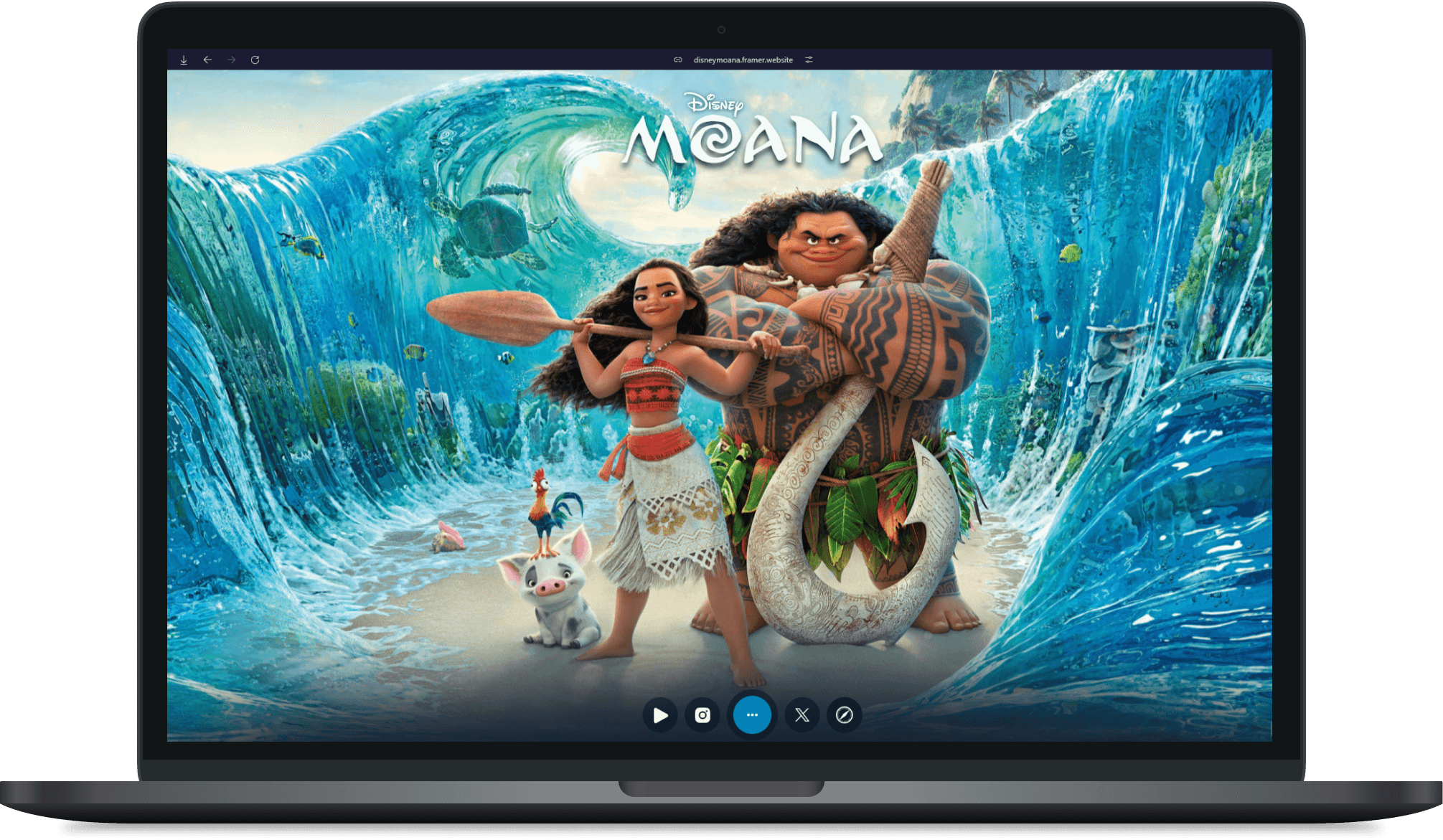
Disney - Moana Landing Page

Bringing a beloved animated adventure to life with vibrant, interactive UI design. 🌊
About
This project is a creative reimagination of a hero landing page for Disney's Moana. Designed to capture the movie’s vibrant spirit and adventurous essence, the page combines bold visuals, dynamic interactions, and immersive hover animations. The goal was to craft an engaging user experience that reflects the heart of Moana—a journey of discovery, courage, and connection to nature.
With an emphasis on fluid motion and intuitive navigation, this project explores how interactive design can elevate storytelling and captivate fans, creating a lasting first impression for the movie.
ROLE
Web Interaction Designer
TIMELINE
2024
LOCATION
Mumbai, India (Remote)
20%
Curiosity, Engagement
42%
CTR(Click Through Rate)
350
Social Shares
Challenge
& Goal
Design a hero landing page that captures the adventurous spirit and visual essence of Disney’s Moana while ensuring it is both engaging and user-friendly. The challenge was to balance intricate animations and hover interactions with seamless usability, ensuring the design remains responsive and accessible across devices.
Goal:
To create an immersive landing page that:
Engages users through vibrant visuals and dynamic interactions.
Encourages exploration with creative hover animations and intuitive navigation.
Reflects the heart of Moana’s story—adventure, nature, and connection—while delivering a memorable first impression.

Research
Competitive Analysis:
I started by diving into the world of movie landing pages, examining designs from other Disney films like Frozen and Encanto. While these pages were visually stunning, I noticed a lack of interactivity that could truly immerse users in the story. Inspired by this gap, I set out to create a landing page that went beyond static visuals, aiming to bring the spirit of Moana alive through engaging, water-inspired animations.
Target Audience:
The target audience for this project included:
Families and children: Seeking fun, vibrant visuals and playful interactions.
Disney enthusiasts: Appreciating intricate details and immersive storytelling.
Casual users and first-time viewers: Needing a captivating introduction to the adventurous world of Moana.
Personal Touch & Decision-Making:
As I designed the page, I kept coming back to one question: How can I make users feel like they’re on the ocean with Moana? This led me to incorporate elements inspired by water and nature:
Waves & Motion: I wanted the hero section to mimic the movement of waves, giving a gentle, flowing animation to background elements.
Bubbles: Adding small, interactive bubble effects was a playful choice to symbolize water and make interactions feel dynamic.
Smooth Hover Effects: Every hover animation had to feel "watery"—gentle, fluid, and seamless, creating an immersive and tactile experience.
Colors & Imagery: I chose tropical, ocean-inspired hues like deep blues and vibrant aquas, combined with island textures to reinforce the Moana theme.
Key Insights:
Users enjoy subtle, theme-aligned micro-interactions, such as bubbles rising when hovering over buttons or wavy motions in background elements.
Animations need to strike a balance—engaging but not overwhelming, maintaining usability while adding delight.
A design that mirrors natural water movements resonates deeply with the adventurous and calming essence of Moana.
These decisions shaped the page to feel not just like a website, but an extension of the movie’s world—inviting users to step into Moana’s journey.
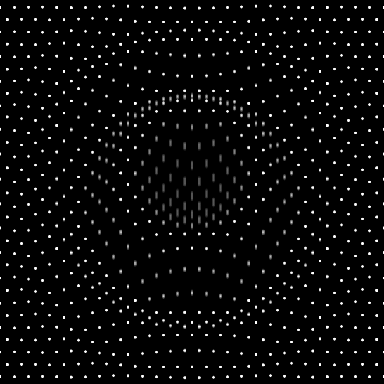
Study of Wave Patterns:
To bring the essence of water into the design, I studied wave patterns using dots and grids. By mapping grid-based wave motions, I explored how subtle, rhythmic movements could mimic the natural flow of the ocean. These patterns inspired interactive elements, like hovering effects that ripple smoothly, creating a sense of fluidity and depth. This approach ensured the animations felt organic while maintaining a clean and structured design.

Ideation
This project was all about bringing Moana’s world to life through interaction, so instead of starting with traditional wireframes, I dove straight into the details of how it would feel. I wanted every click, hover, and scroll to echo the fluidity of the ocean and the adventurous vibe of the movie.
Key ideas that came to life during this phase:
Wave-Like Interactions: I imagined subtle wave motions flowing across the screen—smooth, calming, and natural, just like the ocean.
Bubbles as Playful Feedback: I decided on tiny bubble animations that would appear as users hovered or clicked, adding fun, watery moments.
Dynamic Hero Section: I envisioned the hero section with ripples in the background and floating elements that felt like they were alive, giving a sense of depth and motion.
Smooth Transitions: Every transition, from hover effects to scrolling, was designed to feel effortless—like moving through water.
Layered Depth: I played with parallax effects and layered animations to create a sense of space and depth, much like the vast ocean.
It wasn’t about making something flashy; it was about making something that felt right—calm yet adventurous, just like Moana’s journey. This phase was all about experimenting and playing with ideas until it felt like the ocean was part of the design.
Build & Testing
Once I had my ideas and inspiration, it was time to bring them to life. I wanted the design to feel as smooth and immersive as the ocean, so I started by focusing on the visuals and interactions.
Visual Style:
I went for bold, tropical colors—ocean blues, seafoam greens, and sunset oranges—to really bring the vibe of Moana’s world to the page. These colors were meant to make users feel like they’re stepping into the heart of an island adventure. For the imagery, I chose large visuals of the ocean, the waves, and the lush island—stuff that would instantly take people to Moana’s world. The fonts were designed to be clean and modern but also warm and approachable, keeping the friendly tone of the movie.Interaction Design:
This is where the fun really kicked in. The hover effects were inspired by the fluidity of water—every time a user interacted with something, it had to feel like they were gently dipping their fingers into the sea. Buttons and links ripple, as if they’re floating on water, with smooth transitions that give users the feeling they’re part of the journey. I also added bubbles that would pop up and float away when users hovered or clicked—little details that made the page feel alive and playful.Animation Flow:
The animations weren’t just for show; they were part of the experience. I designed them to flow seamlessly, just like the waves of the ocean. As users scrolled, the page would move with a calm, rhythmic motion, and the background would have a gentle ripple. These subtle effects were meant to pull users deeper into the experience without distracting them from the content.Responsive Layout:
Even though the animations and interactions were the focus, I knew it was important to make sure everything worked smoothly across all screen sizes. I fine-tuned the layout to keep the experience intact on desktop, tablet, and mobile, ensuring that no matter where you viewed it, the page felt as fluid and interactive as possible.Testing & Refining:
After putting everything together, I tested it across devices to make sure the animations weren’t too heavy or clunky. I made some tweaks here and there—slowing down certain animations for mobile, adjusting hover speeds for smoother transitions, and ensuring that the playful bubbles didn’t interfere with the user experience. The goal was to create something that felt natural and effortless, without overwhelming the user.
It was all about finding that balance between stunning visuals and seamless, fun interactions—just like Moana’s journey, full of wonder but with moments of ease.
I built the landing page using Framer, which allowed for smooth animations and quick prototyping. To make the experience even more immersive, I added a custom cursor inspired by Moana—a playful nod to the movie, shaped like a small boat navigating through the sea.
For scalability, I designed placeholders for the navigation that would eventually scale as the project grew. The main sections—Home, Story, Collection, and Team—were mapped out with simple navigation in place, giving a solid structure to expand later. This setup allowed me to focus on the interaction-heavy elements first, with room to integrate more content and features down the line.

Outcome & Takeaways
The landing page received positive feedback, with users praising the smooth interactions and the playful, immersive design. I saw a noticeable increase in engagement, with users spending more time interacting with the hover effects and animations. The wave-like transitions and bubble interactions were especially highlighted as fun and engaging, creating a lasting impression. The responsive design ensured the page worked well across devices, maintaining the fluid experience whether users were on desktop, tablet, or mobile.
Takeaways / Learnings
This project taught me a lot about the power of subtle interactions in creating an immersive experience. I realized that small details—like the custom cursor and smooth animations—can really make a difference in how users engage with a page. I also learned the importance of balancing performance with design; making sure the interactions were fluid across devices and didn't hinder load times or responsiveness was a valuable lesson. Working with Framer was a great experience, as it allowed me to experiment quickly and easily, helping me fine-tune the interactions in real time.
Future Scope
Looking ahead, there's a lot of potential to expand this project. I could add more sections to the website, like a deeper dive into the Moana storyline or an interactive collection of characters and scenes. Adding more dynamic content, like animated trailers or social media feeds, could enhance the user experience even further. I'd also love to experiment with more advanced animation techniques, such as scroll-triggered animations or interactive storytelling elements, to make the page even more engaging. Additionally, optimizing the performance for more complex interactions will be key as I continue to push the boundaries of immersive design.
Screenshots & Content


Summary
This project was a creative exploration of Moana through interactive design. I created a hero landing page with wave-inspired animations and playful hover effects, aiming to make the experience feel like stepping into the ocean. The small details, like a custom cursor and smooth transitions, helped engage users and create an immersive atmosphere.
I learned how to balance engaging design with performance, ensuring smooth interactions across devices. The positive feedback reinforced the effectiveness of these interactive elements. Looking ahead, I’m excited to expand the page and explore more advanced animations to continue enhancing the user experience.
More work this way


Think I’d be a good fit for your team or project? Let’s connect.

Neel Akolkar
Senior Software Engineer & UX Designer. Currently crafting experiences at Capgemini.

© designed & built by NEEL AKOLKAR
made in framer – 2025
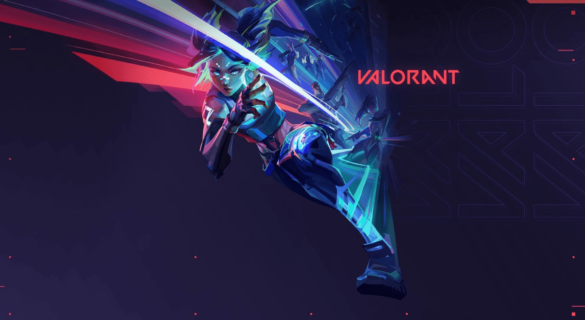
Valorant 404 page
Disney - Moana Landing Page
Disney - Moana Landing Page

Leveling up error pages with a Valorant twist—where creativity meets functionality. 🎮
Bringing a beloved animated adventure to life with vibrant, interactive UI design. 🌊
Bringing a beloved animated adventure to life with vibrant, interactive UI design. 🌊
About
Valorant, developed by Riot Games, is a popular tactical shooter known for its strategic gameplay, unique Agents, and bold, high-tech aesthetic. Its vibrant visuals and intense action have earned it a dedicated global fanbase.
This project reimagines Valorant’s 404 error page, transforming a typical web frustration into an engaging, brand-aligned experience. By blending Valorant’s visuals with playful messaging, the design turns even a “dead-end” into a memorable, immersive moment for players.
This project is a creative reimagination of a hero landing page for Disney's Moana. Designed to capture the movie’s vibrant spirit and adventurous essence, the page combines bold visuals, dynamic interactions, and immersive hover animations. The goal was to craft an engaging user experience that reflects the heart of Moana—a journey of discovery, courage, and connection to nature.
With an emphasis on fluid motion and intuitive navigation, this project explores how interactive design can elevate storytelling and captivate fans, creating a lasting first impression for the movie.
ROLE
Web UX Designer
Web Interaction Designer
TIMELINE
2022
2024
LOCATION
Mumbai, India (Remote)
20%
Curiosity, Engagement
42%
CTR(Click Through Rate)
350
Social Shares
Challenge & Goal
Error pages are often neglected but represent an opportunity to enhance user experience and reinforce brand identity. Valorant’s audience, primarily gamers, expects high-energy visuals and a seamless digital experience.
Generic error pages break immersion and frustrate users, leading to disengagement.
Goal: To design an engaging, branded 404 page that not only entertains but also provides functional navigation, turning a potential frustration point into an enjoyable interaction.
Design a hero landing page that captures the adventurous spirit and visual essence of Disney’s Moana while ensuring it is both engaging and user-friendly. The challenge was to balance intricate animations and hover interactions with seamless usability, ensuring the design remains responsive and accessible across devices.
Goal:
To create an immersive landing page that:
Engages users through vibrant visuals and dynamic interactions.
Encourages exploration with creative hover animations and intuitive navigation.
Reflects the heart of Moana’s story—adventure, nature, and connection—while delivering a memorable first impression.

Research

Conducted interviews and surveys with parents, school staff, and students to understand their daily challenges, motivations, and expectations.
Analyzed user behavior, needs, and pain points to identify patterns and segment the audience into meaningful groups.
Developed detailed personas representing key user types, including their goals, frustrations, and decision-making factors.
Included contextual information such as schedules, carpooling habits, and safety concerns to create realistic and actionable personas.
Used personas to guide design decisions, ensuring solutions were user-centered and aligned with real-world needs.
Competitive Analysis
To ensure the Valorant 404 error page would stand out while providing the best user experience, I conducted a competitive analysis of error pages from other popular games, including Overwatch, Apex Legends, and CS:GO. This helped identify common trends and successful design elements that kept users engaged in frustrating moments:
Humor & Theming: Games like Overwatch and Apex Legends often used humor and in-game elements to make their error pages feel part of the world, enhancing player immersion.
Clear CTAs: Successful error pages featured intuitive call-to-actions (CTAs) that guided users back to meaningful areas, like the homepage or player stats.
Visual Cohesion: The best error pages were visually consistent with the game’s brand, maintaining their color schemes, typography, and overall aesthetics. This consistency helped preserve immersion, ensuring the error page didn’t feel out of place.
User Persona
Valorant’s players are competitive, tech-savvy, and highly engaged with the game’s dynamic universe. They are accustomed to quick, immersive experiences and prefer clean, intuitive interfaces. Understanding this, I aimed to design an error page that not only solved the functional problem of redirecting users but also matched the fast-paced, vibrant atmosphere of Valorant. The tone of the message was key to ensuring that the error page wasn’t seen as a disruption but as an extension of the Valorant experience.
Brand Research
To stay aligned with Valorant’s visual identity, I studied its brand elements—particularly its color palette, typography, and iconography. Valorant’s bold use of sharp lines, modern fonts, and high-contrast colors was crucial to maintaining consistency with the in-game experience. By integrating these elements into the 404 page design, I ensured it felt familiar and native to the game, rather than a generic web error.
By combining these insights, I developed a design that reflected Valorant’s playful yet competitive spirit, ensuring that the error page became part of the broader gaming experience rather than an isolated, frustrating element.
Mapping the User Journey:
Landing on 404 Page:
User encounters the error with a playful design and humorous messaging.
Engagement:
The visual and message create a positive emotional response, minimizing frustration.
Navigation:
Clear, visible CTAs are provided for easy redirection back to key pages.
Action:
User clicks on the CTA and is redirected to a relevant page.
Emotional Outcome:
The user leaves with a smile, ready to continue their Valorant experience.
Competitive Analysis:
I started by diving into the world of movie landing pages, examining designs from other Disney films like Frozen and Encanto. While these pages were visually stunning, I noticed a lack of interactivity that could truly immerse users in the story. Inspired by this gap, I set out to create a landing page that went beyond static visuals, aiming to bring the spirit of Moana alive through engaging, water-inspired animations.
Target Audience:
The target audience for this project included:
Families and children: Seeking fun, vibrant visuals and playful interactions.
Disney enthusiasts: Appreciating intricate details and immersive storytelling.
Casual users and first-time viewers: Needing a captivating introduction to the adventurous world of Moana.
Personal Touch & Decision-Making:
As I designed the page, I kept coming back to one question: How can I make users feel like they’re on the ocean with Moana? This led me to incorporate elements inspired by water and nature:
Waves & Motion: I wanted the hero section to mimic the movement of waves, giving a gentle, flowing animation to background elements.
Bubbles: Adding small, interactive bubble effects was a playful choice to symbolize water and make interactions feel dynamic.
Smooth Hover Effects: Every hover animation had to feel "watery"—gentle, fluid, and seamless, creating an immersive and tactile experience.
Colors & Imagery: I chose tropical, ocean-inspired hues like deep blues and vibrant aquas, combined with island textures to reinforce the Moana theme.
Key Insights:
Users enjoy subtle, theme-aligned micro-interactions, such as bubbles rising when hovering over buttons or wavy motions in background elements.
Animations need to strike a balance—engaging but not overwhelming, maintaining usability while adding delight.
A design that mirrors natural water movements resonates deeply with the adventurous and calming essence of Moana.
These decisions shaped the page to feel not just like a website, but an extension of the movie’s world—inviting users to step into Moana’s journey.
Study of Wave Patterns:
To bring the essence of water into the design, I studied wave patterns using dots and grids. By mapping grid-based wave motions, I explored how subtle, rhythmic movements could mimic the natural flow of the ocean. These patterns inspired interactive elements, like hovering effects that ripple smoothly, creating a sense of fluidity and depth. This approach ensured the animations felt organic while maintaining a clean and structured design.
Process
Ideation and Concept Development
Based on user insights, brainstormed and explored several design directions to solve the pain points around scheduling, safety, and usability.
Developed user flows and wireframes to define the app’s structure and key features.
Prioritized features like real-time updates, carpool scheduling, and user trust mechanisms to align with user needs and business goals.
Prototyping and Testing
Created interactive prototypes to visualize key features and flows, ensuring ease of navigation and accessibility.
Conducted usability tests with parents and stakeholders to gather feedback and iterate on designs.
Refined designs based on testing feedback, focusing on enhancing the user experience for both parents and kids.
Visual Design and Branding
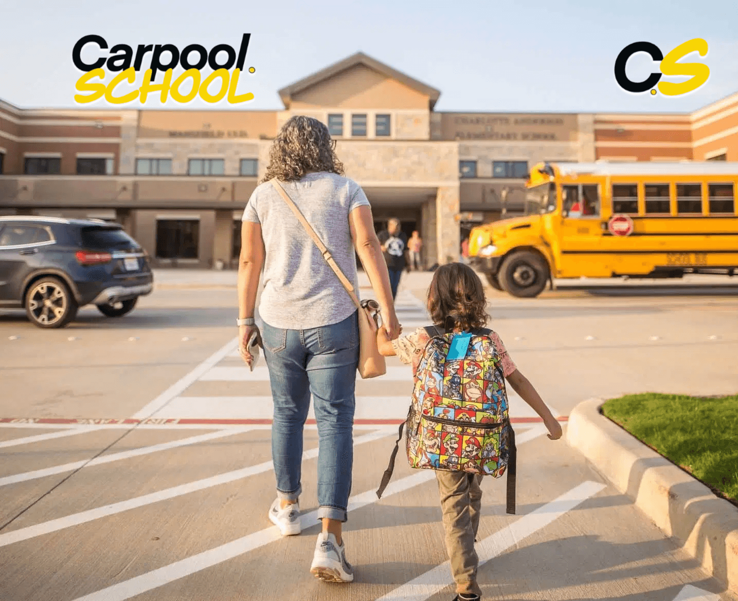
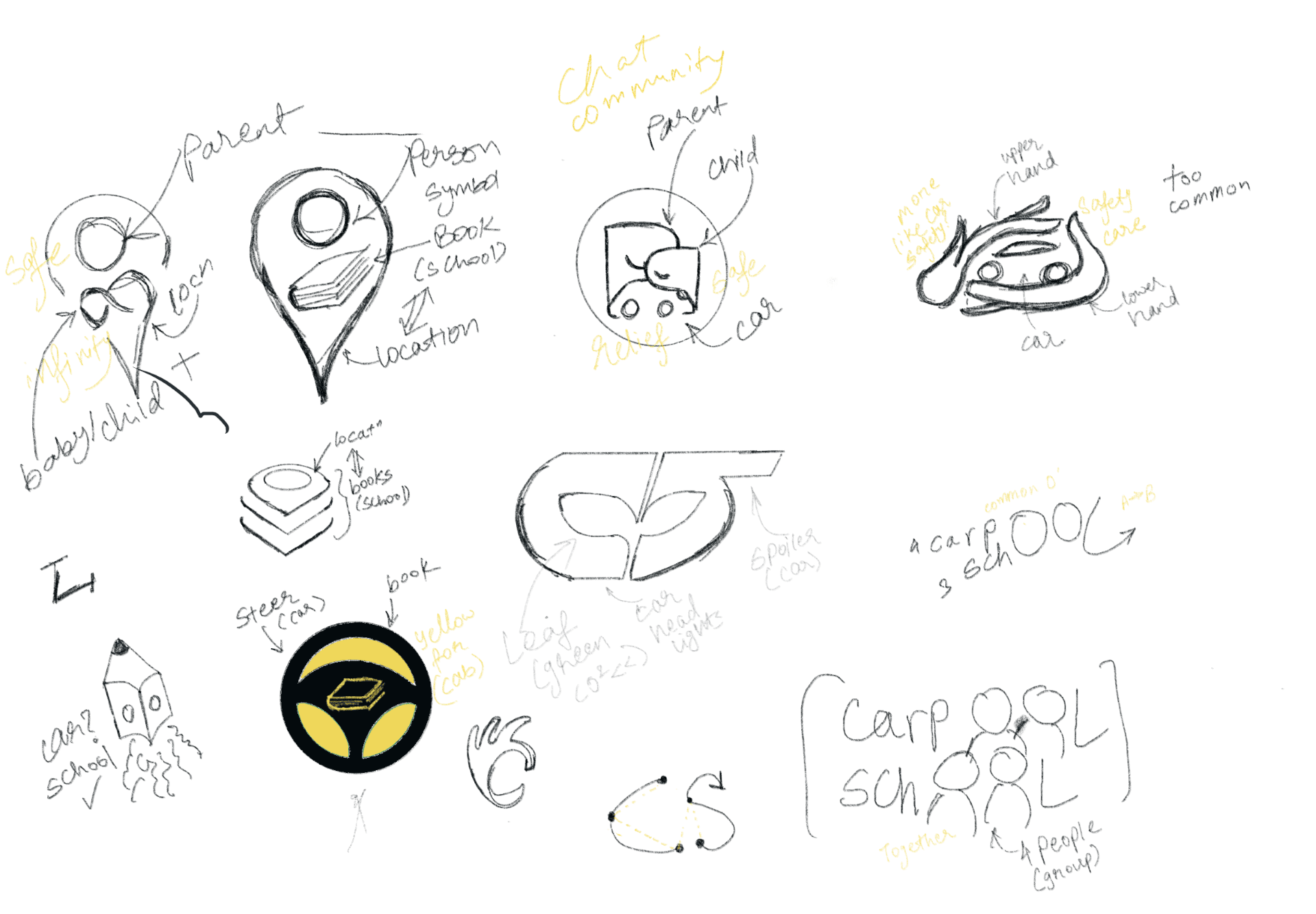
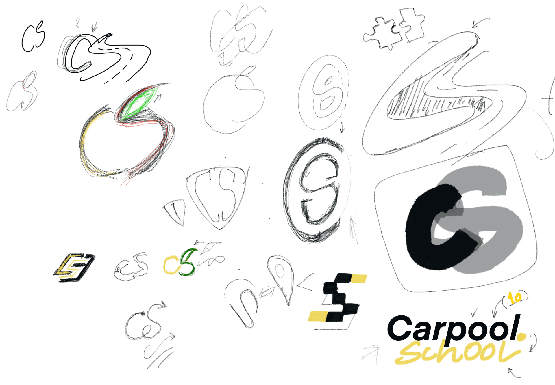
Developed high-fidelity mockups, incorporating the brand identity system (logo, color palette, typography) to ensure visual consistency across web and mobile platforms.
Focused on creating a user-friendly interface with clear, simple, and modern aesthetics to enhance usability and trust.
Integrated visual elements that aligned with the company’s mission of safety, reliability, and connection.
Collaboration and Development
Collaborated closely with the development team to ensure designs were technically feasible and implemented accurately.
Provided detailed design specifications and maintained a constant feedback loop to ensure alignment throughout the development process.
Launch and Continuous Improvement
Assisted in launching the web and mobile apps, closely monitoring user engagement and feedback post-launch.
Analyzed usage data and iterated on features to improve the overall user experience and retention, including enhancing the scheduling system and adding more personalization options for parents.

Information Architecture
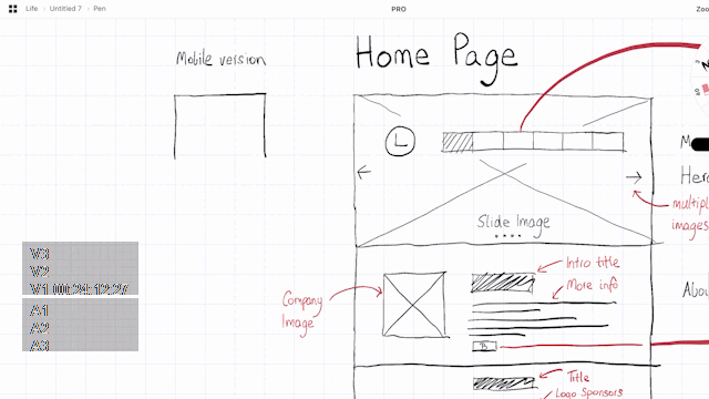
Wireframing
High-Fidelity Wireframe
Prototype
Prototyping & Testing
Build & Testing
In this phase, I transformed the conceptual 404 page design into an interactive and functional prototype. The goal was to simulate how users would interact with the error page, ensuring the flow is intuitive and engaging.
High-Fidelity Wireframes/Mockups:
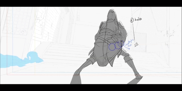
I created mockups of the 404 page, ensuring the error message, hero illustration, and call-to-action buttons were placed strategically. The page is designed to be bold and glitchy, maintaining the Valorant theme. This ensures users immediately know they’re on an error page but still engage with the brand’s style.Interactive Prototypes:
I built the interactive prototype using Figma, ensuring that users could click on the primary CTA (Return to Home) and secondary CTA (Back to Matches), along with hover effects on the buttons to mimic the glitch animation. The prototype was tested on various devices to ensure responsiveness.
I tested the prototype with Valorant players to ensure the tone and design matched the audience's expectations. I observed how users interacted with the page and whether they quickly identified the error message and CTAs.
Once I had my ideas and inspiration, it was time to bring them to life. I wanted the design to feel as smooth and immersive as the ocean, so I started by focusing on the visuals and interactions.
Visual Style:
I went for bold, tropical colors—ocean blues, seafoam greens, and sunset oranges—to really bring the vibe of Moana’s world to the page. These colors were meant to make users feel like they’re stepping into the heart of an island adventure. For the imagery, I chose large visuals of the ocean, the waves, and the lush island—stuff that would instantly take people to Moana’s world. The fonts were designed to be clean and modern but also warm and approachable, keeping the friendly tone of the movie.Interaction Design:
This is where the fun really kicked in. The hover effects were inspired by the fluidity of water—every time a user interacted with something, it had to feel like they were gently dipping their fingers into the sea. Buttons and links ripple, as if they’re floating on water, with smooth transitions that give users the feeling they’re part of the journey. I also added bubbles that would pop up and float away when users hovered or clicked—little details that made the page feel alive and playful.Animation Flow:
The animations weren’t just for show; they were part of the experience. I designed them to flow seamlessly, just like the waves of the ocean. As users scrolled, the page would move with a calm, rhythmic motion, and the background would have a gentle ripple. These subtle effects were meant to pull users deeper into the experience without distracting them from the content.Responsive Layout:
Even though the animations and interactions were the focus, I knew it was important to make sure everything worked smoothly across all screen sizes. I fine-tuned the layout to keep the experience intact on desktop, tablet, and mobile, ensuring that no matter where you viewed it, the page felt as fluid and interactive as possible.Testing & Refining:
After putting everything together, I tested it across devices to make sure the animations weren’t too heavy or clunky. I made some tweaks here and there—slowing down certain animations for mobile, adjusting hover speeds for smoother transitions, and ensuring that the playful bubbles didn’t interfere with the user experience. The goal was to create something that felt natural and effortless, without overwhelming the user.
It was all about finding that balance between stunning visuals and seamless, fun interactions—just like Moana’s journey, full of wonder but with moments of ease.
I built the landing page using Framer, which allowed for smooth animations and quick prototyping. To make the experience even more immersive, I added a custom cursor inspired by Moana—a playful nod to the movie, shaped like a small boat navigating through the sea.
For scalability, I designed placeholders for the navigation that would eventually scale as the project grew. The main sections—Home, Story, Collection, and Team—were mapped out with simple navigation in place, giving a solid structure to expand later. This setup allowed me to focus on the interaction-heavy elements first, with room to integrate more content and features down the line.
Ideation
Error Message:
The 404 page features a playful, direct error message: “Oops, looks like you've missed the mark!”
This message avoids the usual dry “404 error” language or complex lore, instead focusing on Valorant's core theme of precision and accuracy, making it feel more like a lighthearted in-game situation rather than a frustrating technical error. The tone matches the game’s playful but competitive environment, maintaining a fun, engaging experience for the user.
Hero Illustration:
The central visual element is a Valorant Agent who appears humorously confused or lost in an empty map. The Agent’s expression and body language convey a sense of being "off course," but it’s more comedic than serious.
The Agent is not tied to any complex lore or storyline; instead, the illustration embodies the frustration of an error without over-explaining or detracting from the user’s experience.
This quirky, humorous illustration ties directly to Valorant’s visual identity, keeping the user engaged while maintaining the game’s bold and dynamic aesthetics.
Call-to-Actions (CTAs):
Primary CTA: “Return to Home” — This button is prominent and directly leads the user back to the homepage. It is placed in a way that makes it the most accessible option, ensuring users can quickly regain their bearings.
Secondary CTA: “Back to Matches” — A second, clearly visible button that offers the option to return to active gameplay or check match history. This secondary CTA ensures users have an alternative option if they’re more focused on getting back to their game rather than exploring the homepage.
Both CTAs are bold, with glitchy effects that interact with the user on hover, enhancing the dynamic and playful nature of the page.
Visual Style:
The overall design is bold and glitchy, embodying the energetic and high-tech aesthetic of Valorant. The glitch effects are intentional, enhancing the feeling of being in an “error zone” while tying the design to the game’s futuristic, tech-driven world.
Sharp edges, contrasting colors, and vivid animations keep the page visually engaging without it feeling static or overly minimal. The glitching elements on the page could also visually imply that the user has “missed” something, adding a deeper layer of interaction.
The layout is clean but not minimal — the focus is on creating an immersive error experience that doesn’t overwhelm the user with too many elements. The error message and CTAs are the main focal points, with animations and micro-interactions drawing attention to them without distracting from the core message.
User Interaction:
The design incorporates subtle interactive elements that elevate the experience. For example, the glitch effects could animate when users hover over the buttons, adding a fun layer of engagement. These micro-interactions would be in line with Valorant’s gameplay, where small, sharp moments of action are a key part of the user experience.
The page is also responsive, ensuring that on smaller screens, the design remains bold and accessible, with the same glitch effects and CTA prominence adapting to mobile or tablet views.
This project was all about bringing Moana’s world to life through interaction, so instead of starting with traditional wireframes, I dove straight into the details of how it would feel. I wanted every click, hover, and scroll to echo the fluidity of the ocean and the adventurous vibe of the movie.
Key ideas that came to life during this phase:
Wave-Like Interactions: I imagined subtle wave motions flowing across the screen—smooth, calming, and natural, just like the ocean.
Bubbles as Playful Feedback: I decided on tiny bubble animations that would appear as users hovered or clicked, adding fun, watery moments.
Dynamic Hero Section: I envisioned the hero section with ripples in the background and floating elements that felt like they were alive, giving a sense of depth and motion.
Smooth Transitions: Every transition, from hover effects to scrolling, was designed to feel effortless—like moving through water.
Layered Depth: I played with parallax effects and layered animations to create a sense of space and depth, much like the vast ocean.
It wasn’t about making something flashy; it was about making something that felt right—calm yet adventurous, just like Moana’s journey. This phase was all about experimenting and playing with ideas until it felt like the ocean was part of the design.
Information Architecture
Outcome
Website & Social Media Redesign: Transformed the company’s website and social platforms, creating a cohesive and modern digital identity that boosted user engagement by 71%.
Brand Identity System: Designed a unique logo and a complete brand identity system, including colors and typography, to enhance brand recognition and market positioning.
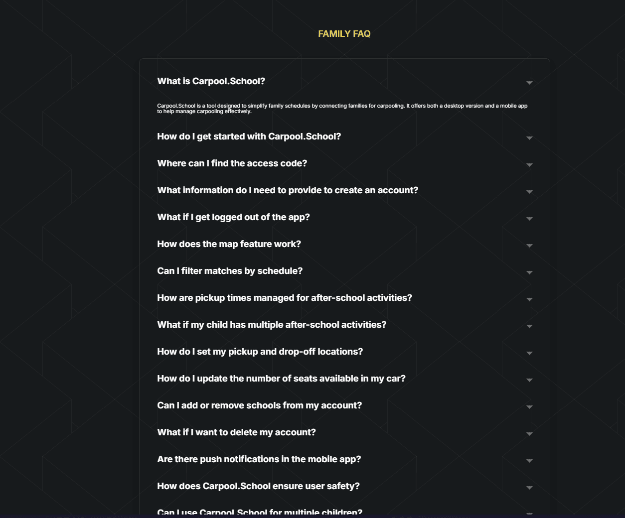
Web Application: Spearheaded the end-to-end design and development of a web application, delivering intuitive interfaces and seamless user experiences that improved user satisfaction and adoption.
Mobile App Enhancements: Led a cross-functional team of designers and developers to address design challenges in the mobile carpool app, delivering innovative solutions that enhanced usability and retention.
Outcome
Outcome & Takeaways
The final Valorant 404 Error Page was designed to provide a fun, engaging, and immersive experience for users who encounter an error while browsing the Valorant website. By combining bold, glitchy visuals with interactive elements, the page successfully captures the essence of the Valorant universe while providing a seamless navigation experience.
The project achieved the following:
Dynamic Hero Illustration: The page features a Valorant Agent in a humorous, off-course pose, creating an immersive, relatable experience while staying true to the game’s energetic aesthetic.
Intuitive CTAs: The two main call-to-actions, “Return to Home” and “Back to Matches”, were clearly positioned to guide users back to their main goals (home or matches). They were designed with bold visuals and glitch effects, making them interactive and responsive.
Visually Consistent Design: The glitchy animations, sharp edges, and vibrant colors captured the bold and energetic visual style of Valorant. The design was optimized for responsiveness across devices, ensuring accessibility on mobile, tablet, and desktop views.
User Engagement: Feedback from user testing showed that the design was intuitive, and the glitch effects were fun without being distracting. Users understood the error message quickly and appreciated the clear navigation options provided by the CTAs.
The landing page received positive feedback, with users praising the smooth interactions and the playful, immersive design. I saw a noticeable increase in engagement, with users spending more time interacting with the hover effects and animations. The wave-like transitions and bubble interactions were especially highlighted as fun and engaging, creating a lasting impression. The responsive design ensured the page worked well across devices, maintaining the fluid experience whether users were on desktop, tablet, or mobile.
Takeaways / Learnings
This project taught me a lot about the power of subtle interactions in creating an immersive experience. I realized that small details—like the custom cursor and smooth animations—can really make a difference in how users engage with a page. I also learned the importance of balancing performance with design; making sure the interactions were fluid across devices and didn't hinder load times or responsiveness was a valuable lesson. Working with Framer was a great experience, as it allowed me to experiment quickly and easily, helping me fine-tune the interactions in real time.
Future Scope
Looking ahead, there's a lot of potential to expand this project. I could add more sections to the website, like a deeper dive into the Moana storyline or an interactive collection of characters and scenes. Adding more dynamic content, like animated trailers or social media feeds, could enhance the user experience even further. I'd also love to experiment with more advanced animation techniques, such as scroll-triggered animations or interactive storytelling elements, to make the page even more engaging. Additionally, optimizing the performance for more complex interactions will be key as I continue to push the boundaries of immersive design.
Results . Photos . Archives
Screenshots & Content

Summary
The Valorant 404 Error Page project aimed to create a dynamic, user-friendly page that not only communicated the error effectively but also enhanced the user experience with interactive, game-themed design elements. The page was designed with bold visuals, incorporating glitch effects and Valorant-style illustrations to make an error page feel like an extension of the game's aesthetic rather than a frustrating obstacle.
Through careful prototyping, user testing, and refinements, the final design maintained a balance between functionality and engagement, offering users a seamless and entertaining experience. The CTAs ensured users could quickly return to their intended path, while the visual design kept them immersed in the world of Valorant.
This project was a successful demonstration of how error pages can be leveraged to reinforce brand identity, create a positive user experience, and encourage users to return to their intended navigation path with ease and enjoyment.
This project was a creative exploration of Moana through interactive design. I created a hero landing page with wave-inspired animations and playful hover effects, aiming to make the experience feel like stepping into the ocean. The small details, like a custom cursor and smooth transitions, helped engage users and create an immersive atmosphere.
I learned how to balance engaging design with performance, ensuring smooth interactions across devices. The positive feedback reinforced the effectiveness of these interactive elements. Looking ahead, I’m excited to expand the page and explore more advanced animations to continue enhancing the user experience.
Photo Archives
Connect to Content
Add layers or components to swipe between.


Summary
Carpool.School project has made me learn the impact of thoughtful design and collaboration. By addressing the specific needs of parents, school communities, and the challenges of school transportation in the USA, the modernized digital presence, cohesive brand identity, and improved app experiences positioned Carpool.School as a leader in its space, significantly boosting engagement and satisfaction among its users.
Outcome
The final Valorant 404 Error Page was designed to provide a fun, engaging, and immersive experience for users who encounter an error while browsing the Valorant website. By combining bold, glitchy visuals with interactive elements, the page successfully captures the essence of the Valorant universe while providing a seamless navigation experience.
The project achieved the following:
Dynamic Hero Illustration: The page features a Valorant Agent in a humorous, off-course pose, creating an immersive, relatable experience while staying true to the game’s energetic aesthetic.
Intuitive CTAs: The two main call-to-actions, “Return to Home” and “Back to Matches”, were clearly positioned to guide users back to their main goals (home or matches). They were designed with bold visuals and glitch effects, making them interactive and responsive.
Visually Consistent Design: The glitchy animations, sharp edges, and vibrant colors captured the bold and energetic visual style of Valorant. The design was optimized for responsiveness across devices, ensuring accessibility on mobile, tablet, and desktop views.
User Engagement: Feedback from user testing showed that the design was intuitive, and the glitch effects were fun without being distracting. Users understood the error message quickly and appreciated the clear navigation options provided by the CTAs.
Results . Photos . Archives
Connect to Content
Add layers or components to swipe between.
Summary
The Valorant 404 Error Page project aimed to create a dynamic, user-friendly page that not only communicated the error effectively but also enhanced the user experience with interactive, game-themed design elements. The page was designed with bold visuals, incorporating glitch effects and Valorant-style illustrations to make an error page feel like an extension of the game's aesthetic rather than a frustrating obstacle.
Through careful prototyping, user testing, and refinements, the final design maintained a balance between functionality and engagement, offering users a seamless and entertaining experience. The CTAs ensured users could quickly return to their intended path, while the visual design kept them immersed in the world of Valorant.
This project was a successful demonstration of how error pages can be leveraged to reinforce brand identity, create a positive user experience, and encourage users to return to their intended navigation path with ease and enjoyment.
More work this way
More work this way


Think I’d be a good fit for your team or project? Let’s connect.
Neel Akolkar
Senior Software Engineer & UX Designer. Currently crafting experiences at Capgemini.
© designed & built by NEEL AKOLKAR
made in framer – 2025
Think I’d be a good fit for your team or project? Let’s connect.
Neel Akolkar
Senior Software Engineer & UX Designer. Currently crafting experiences at Capgemini.
© designed & built by NEEL AKOLKAR
made in framer – 2025
Think I’d be a good fit for your team or project? Let’s connect.
Neel Akolkar
Senior Software Engineer & UX Designer. Currently crafting experiences at Capgemini.
© designed & built by NEEL AKOLKAR
made in framer – 2025
neelakolkar2001@gmail.com
Email copied!
neelakolkar2001@gmail.com
Email copied!