neelakolkar2001@gmail.com
Email copied!

Annotation Library
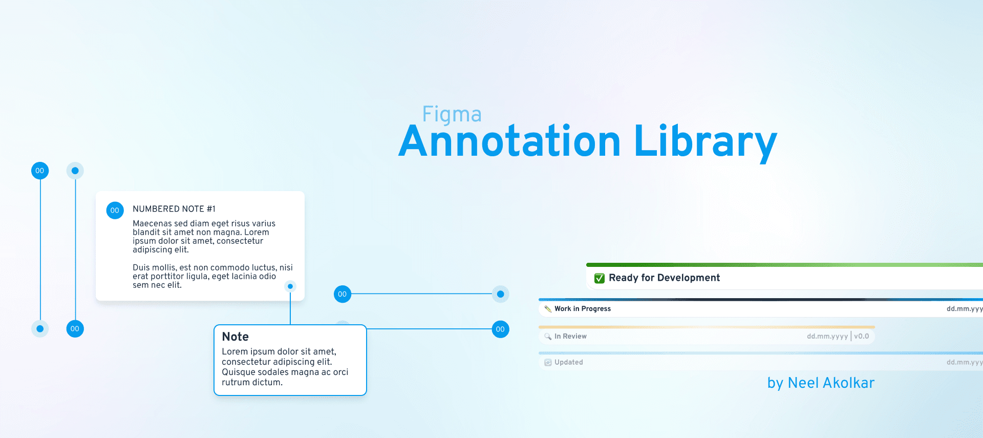
Annotate, Align, Deliver: Your ultimate Figma toolkit for seamless handoffs.
About
To streamline collaboration and communication during the design-to-development handoff process, I designed and developed an Annotation Library for Figma. Built entirely on a secret brand's design guidelines, this library ensures consistency, scalability, and efficiency across design teams. It features reusable and importable Figma components tailored to provide clear visual annotations in the design workflow.
ROLE
UI Designer
TIMELINE
NA
LOCATION
NA
5%
Hand off friction
3+
Collab Teams
Challenge
& Goal
Design teams often face challenges in effectively communicating details to developers and stakeholders. Without a structured approach to annotations, essential information—like status updates, design notes, or specific pointers—can get lost, leading to delays and inconsistencies.
Objective: To create a Figma Annotation Library that aligns with the brand’s guidelines, enabling designers to efficiently annotate their work for seamless handoffs and better cross-team communication.
Key Features
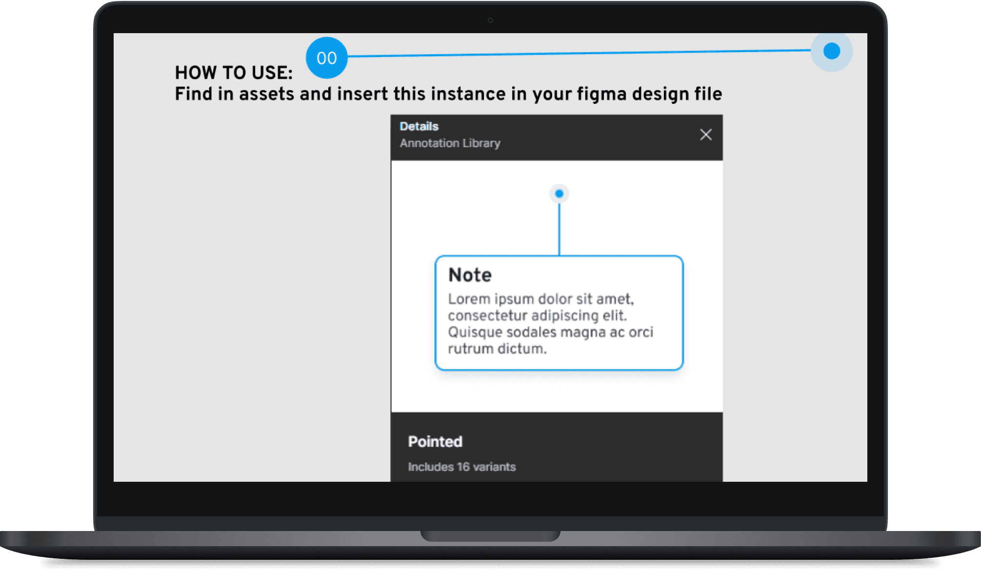
Reusable Components: Designed reusable Figma components, allowing the library to be imported and adapted easily across different projects.
Pointers and Notes: Created various types of pointers, notes, and pointed notes to highlight key areas of interest or concern.
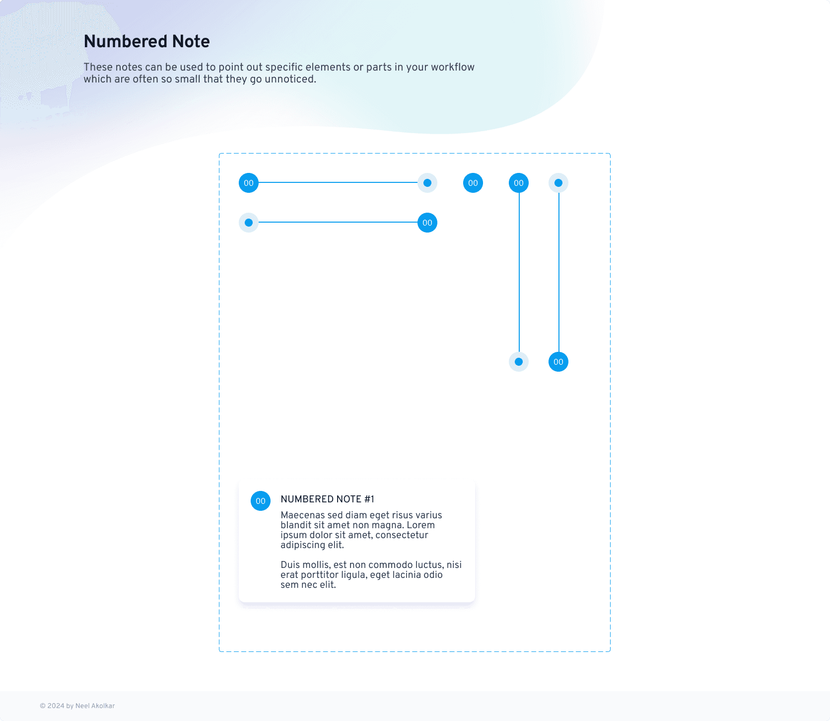
Numbered Notes: Developed numbered notes to create ordered sequences, making it easier to follow complex workflows or layered designs.
Status Bars: Designed status bars for development handoffs, enabling quick updates on task statuses (e.g., "In Progress," "Completed," or "Needs Review").
Brand Alignment: Each component was crafted in line with the brand’s design guidelines to maintain a cohesive visual identity.
Research
Studied the brand’s design system to ensure every component adhered to its visual language.
Gathered feedback from designers and developers to understand annotation pain points.
Prototyping and Figma Components
Designed low-fidelity wireframes to map out component interactions and usage.
Progressed to high-fidelity prototypes for usability testing within Figma.

Prototype
Usability and User Testing
Iterative Development
Conducted multiple iterations based on feedback, ensuring the components were intuitive, flexible, and functional.
Visual Design & Branding
Throughout the design process, I adhered to a Design System to maintain visual consistency across the app. The system of the brand included reusable components such as buttons, forms, navigation elements, and typography. These components ensured the app’s UI was both visually cohesive and easy to use.
Key benefits of using the design system:
Scalability: Components were designed to adapt to future needs, ensuring the design could evolve without losing consistency.
Efficiency: The system streamlined the design process by reusing established patterns across the app.
Consistency: It ensured that users experienced a seamless, cohesive interface across all sections of the app.
Outcome & Feedback
The Annotation Library reduced time spent on creating annotations by 40%, enabling faster communication and more efficient workflows.
The reusable components provided a consistent and professional look across projects, improving clarity and collaboration.
Development teams reported a significant improvement in understanding design specifications during handoffs.
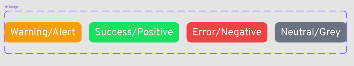
Badges for identification

Status Bars for hand-offs
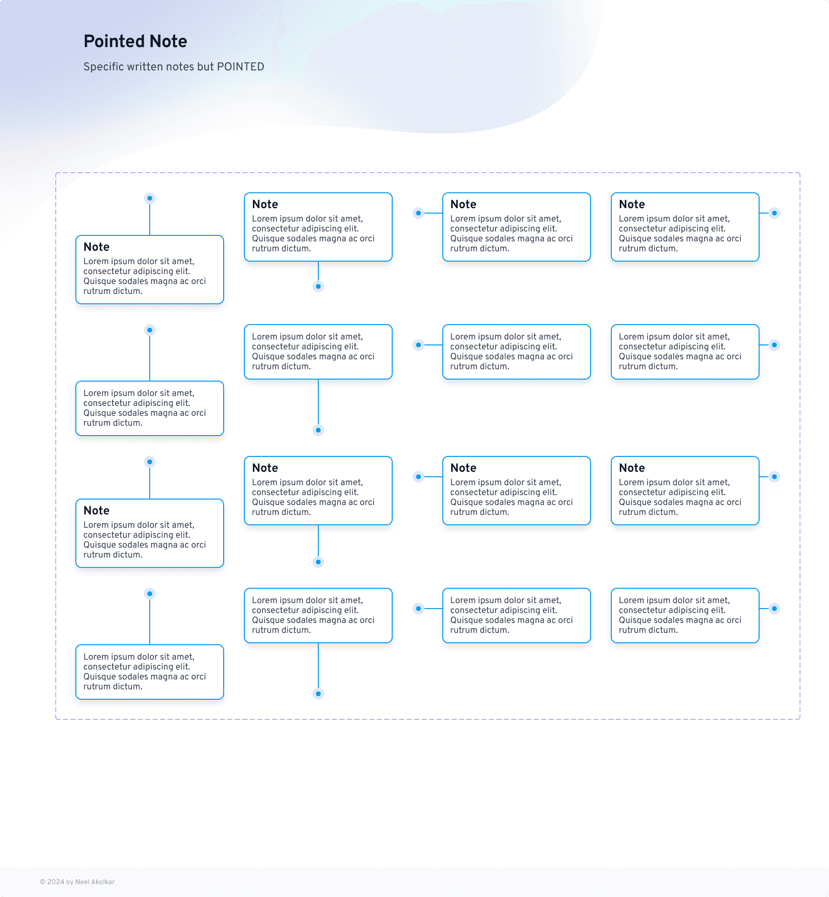
Notes and numbered prototypes
Summary
What I Learned
This project deepened my understanding of the critical role design systems play in fostering collaboration. It emphasized the value of aligning every detail with brand guidelines while prioritizing usability. I also discovered how small, reusable design elements can drive significant improvements in productivity and communication across teams.
Feedback from fellow designers praised the library for its clarity, ease of use, and seamless adaptability, reinforcing its impact on streamlining workflows.
Next Steps
Expand the library to include additional annotation styles to meet evolving team needs.
Incorporate accessibility features for greater inclusivity.
Develop a comprehensive guide or tutorial for onboarding designers new to the library.
Ready to streamline your workflow?
Explore and integrate the Annotation Library into your projects today to enhance communication and efficiency in your design process!
More work this way


Think I’d be a good fit for your team or project? Let’s connect.

Neel Akolkar
Senior Software Engineer & UX Designer. Currently crafting experiences at Capgemini.

© designed & built by NEEL AKOLKAR
made in framer – 2025
Annotation Library
Annotate, Align, Deliver: Your ultimate Figma toolkit for seamless handoffs.
About
To streamline collaboration and communication during the design-to-development handoff process, I designed and developed an Annotation Library for Figma. Built entirely on a secret brand's design guidelines, this library ensures consistency, scalability, and efficiency across design teams. It features reusable and importable Figma components tailored to provide clear visual annotations in the design workflow.
ROLE
UI Designer
TIMELINE
NA
LOCATION
NA
5%
Hand off friction
3+
Collab Teams
Challenge & Goal
Design teams often face challenges in effectively communicating details to developers and stakeholders. Without a structured approach to annotations, essential information—like status updates, design notes, or specific pointers—can get lost, leading to delays and inconsistencies.
Objective: To create a Figma Annotation Library that aligns with the brand’s guidelines, enabling designers to efficiently annotate their work for seamless handoffs and better cross-team communication.

Key Features
Reusable Components: Designed reusable Figma components, allowing the library to be imported and adapted easily across different projects.
Pointers and Notes: Created various types of pointers, notes, and pointed notes to highlight key areas of interest or concern.
Numbered Notes: Developed numbered notes to create ordered sequences, making it easier to follow complex workflows or layered designs.
Status Bars: Designed status bars for development handoffs, enabling quick updates on task statuses (e.g., "In Progress," "Completed," or "Needs Review").
Brand Alignment: Each component was crafted in line with the brand’s design guidelines to maintain a cohesive visual identity.
Research
Studied the brand’s design system to ensure every component adhered to its visual language.
Gathered feedback from designers and developers to understand annotation pain points.
Prototyping and Figma Components
Designed low-fidelity wireframes to map out component interactions and usage.
Progressed to high-fidelity prototypes for usability testing within Figma.
Prototype
Usability and User Testing
Iterative Development
Conducted multiple iterations based on feedback, ensuring the components were intuitive, flexible, and functional.
Visual Design & Branding
Throughout the design process, I adhered to a Design System to maintain visual consistency across the app. The system of the brand included reusable components such as buttons, forms, navigation elements, and typography. These components ensured the app’s UI was both visually cohesive and easy to use.
Key benefits of using the design system:
Scalability: Components were designed to adapt to future needs, ensuring the design could evolve without losing consistency.
Efficiency: The system streamlined the design process by reusing established patterns across the app.
Consistency: It ensured that users experienced a seamless, cohesive interface across all sections of the app.
Outcome & Feedback
The Annotation Library reduced time spent on creating annotations by 40%, enabling faster communication and more efficient workflows.
The reusable components provided a consistent and professional look across projects, improving clarity and collaboration.
Development teams reported a significant improvement in understanding design specifications during handoffs.
Badges for identification
Status Bars for hand-offs
Notes and numbered prototypes
Summary
What I Learned
This project deepened my understanding of the critical role design systems play in fostering collaboration. It emphasized the value of aligning every detail with brand guidelines while prioritizing usability. I also discovered how small, reusable design elements can drive significant improvements in productivity and communication across teams.
Feedback from fellow designers praised the library for its clarity, ease of use, and seamless adaptability, reinforcing its impact on streamlining workflows.
Next Steps
Expand the library to include additional annotation styles to meet evolving team needs.
Incorporate accessibility features for greater inclusivity.
Develop a comprehensive guide or tutorial for onboarding designers new to the library.
Ready to streamline your workflow?
Explore and integrate the Annotation Library into your projects today to enhance communication and efficiency in your design process!
More work this way

Think I’d be a good fit for your team or project? Let’s connect.
Neel Akolkar
Senior Software Engineer & UX Designer. Currently crafting experiences at Capgemini.
© designed & built by NEEL AKOLKAR
made in framer – 2025
Think I’d be a good fit for your team or project? Let’s connect.
Neel Akolkar
Senior Software Engineer & UX Designer. Currently crafting experiences at Capgemini.
© designed & built by NEEL AKOLKAR
made in framer – 2025
neelakolkar2001@gmail.com
Email copied!
Annotation Library
Annotate, Align, Deliver: Your ultimate Figma toolkit for seamless handoffs.
About
To streamline collaboration and communication during the design-to-development handoff process, I designed and developed an Annotation Library for Figma. Built entirely on a secret brand's design guidelines, this library ensures consistency, scalability, and efficiency across design teams. It features reusable and importable Figma components tailored to provide clear visual annotations in the design workflow.
ROLE
UI Designer
TIMELINE
NA
LOCATION
NA
5%
Hand off friction
3+
Collab Teams
Challenge & Goal
Design teams often face challenges in effectively communicating details to developers and stakeholders. Without a structured approach to annotations, essential information—like status updates, design notes, or specific pointers—can get lost, leading to delays and inconsistencies.
Objective: To create a Figma Annotation Library that aligns with the brand’s guidelines, enabling designers to efficiently annotate their work for seamless handoffs and better cross-team communication.
Key Features
Reusable Components: Designed reusable Figma components, allowing the library to be imported and adapted easily across different projects.
Pointers and Notes: Created various types of pointers, notes, and pointed notes to highlight key areas of interest or concern.
Numbered Notes: Developed numbered notes to create ordered sequences, making it easier to follow complex workflows or layered designs.
Status Bars: Designed status bars for development handoffs, enabling quick updates on task statuses (e.g., "In Progress," "Completed," or "Needs Review").
Brand Alignment: Each component was crafted in line with the brand’s design guidelines to maintain a cohesive visual identity.
Research
Studied the brand’s design system to ensure every component adhered to its visual language.
Gathered feedback from designers and developers to understand annotation pain points.
Prototyping and Figma Components
Designed low-fidelity wireframes to map out component interactions and usage.
Progressed to high-fidelity prototypes for usability testing within Figma.
Prototype
Usability and User Testing
Iterative Development
Conducted multiple iterations based on feedback, ensuring the components were intuitive, flexible, and functional.
Visual Design & Branding
Throughout the design process, I adhered to a Design System to maintain visual consistency across the app. The system of the brand included reusable components such as buttons, forms, navigation elements, and typography. These components ensured the app’s UI was both visually cohesive and easy to use.
Key benefits of using the design system:
Scalability: Components were designed to adapt to future needs, ensuring the design could evolve without losing consistency.
Efficiency: The system streamlined the design process by reusing established patterns across the app.
Consistency: It ensured that users experienced a seamless, cohesive interface across all sections of the app.
Outcome & Feedback
The Annotation Library reduced time spent on creating annotations by 40%, enabling faster communication and more efficient workflows.
The reusable components provided a consistent and professional look across projects, improving clarity and collaboration.
Development teams reported a significant improvement in understanding design specifications during handoffs.
Badges for identification
Status Bars for hand-offs
Notes and numbered prototypes
Summary
What I Learned
This project deepened my understanding of the critical role design systems play in fostering collaboration. It emphasized the value of aligning every detail with brand guidelines while prioritizing usability. I also discovered how small, reusable design elements can drive significant improvements in productivity and communication across teams.
Feedback from fellow designers praised the library for its clarity, ease of use, and seamless adaptability, reinforcing its impact on streamlining workflows.
Next Steps
Expand the library to include additional annotation styles to meet evolving team needs.
Incorporate accessibility features for greater inclusivity.
Develop a comprehensive guide or tutorial for onboarding designers new to the library.
Ready to streamline your workflow?
Explore and integrate the Annotation Library into your projects today to enhance communication and efficiency in your design process!
More work this way
Think I’d be a good fit for your team or project? Let’s connect.
Neel Akolkar
Senior Software Engineer & UX Designer. Currently crafting experiences at Capgemini.
© designed & built by NEEL AKOLKAR
made in framer – 2025
Think I’d be a good fit for your team or project? Let’s connect.
Neel Akolkar
Senior Software Engineer & UX Designer. Currently crafting experiences at Capgemini.
© designed & built by NEEL AKOLKAR
made in framer – 2025
neelakolkar2001@gmail.com
Email copied!